


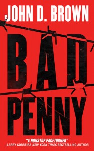
For Awful Intent, I looked around at different cover design shops and decided to use Damonza. I sent over the brief, and we began. What I needed was a cover in the same style of Bad Penny. A match. I also told Grady, the designer, that if he did something new with Bad Penny, I might consider it.
He sent back these.
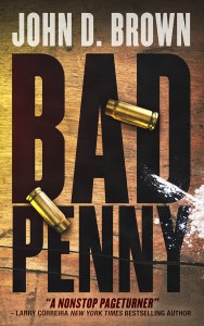
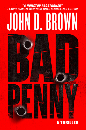
I loved what he did with Bad Penny. But it was nowhere near what we’d done with the original. And none of the others matched either. And that was a problem. I need all of the covers in the series to look like siblings.
We went back and forth with a number of iterations. Then decided to focus on Bad Penny.
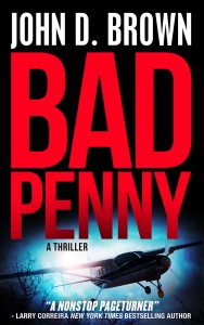
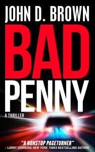
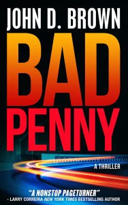
And then I realized that I was falling prey to shiny object syndrome. It’s the bane of my life. There were all sorts of great ways to approach the cover, but I had already spent hours sorting through all that with the Bad Penny original. And the cover must be doing okay, because we sold lots of copies last year. I decided for everyone’s sanity to stick with the original decisions and parameters. That meant:
- Bold, action-thriller colors
- High contrast
- Big fonts
- Some texture
- And some small element over top
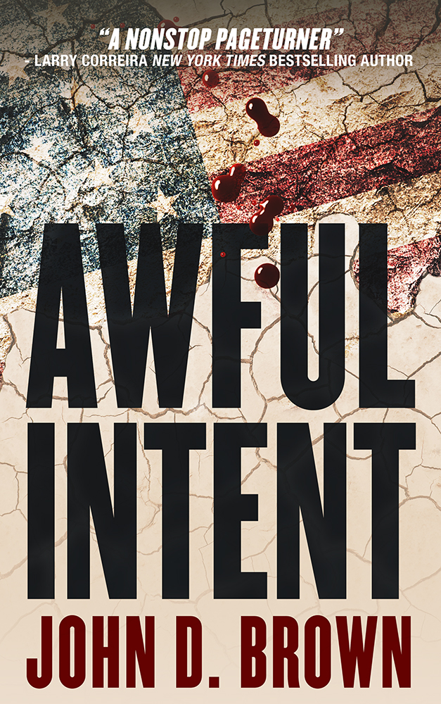
But I was still having a hard time clarifying in my mind something that was eluding me. Luckily I was in Cedar City for the Shakespeare Festival at the time and having lunch with Dixon and Linda Leavitt. Dixon pointed out that I was waffling between a literal and symbolic approach. Once he said that, I could see exactly what he meant. For example, the Bad Penny in the first batch was painted on a board. It was more realistic. The red Awful Intent was more symbolic. He also pointed out that I had used a small element in the original. With that clarity, we went back to work.
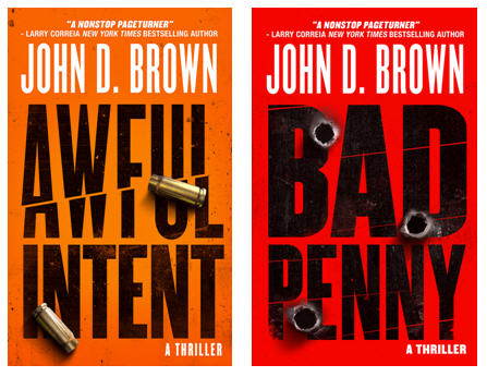
I’m very pleased with the finals (BTW, I’ll be tweaking the text above my name in Awful Intent; so that one isn’t final-final yet).
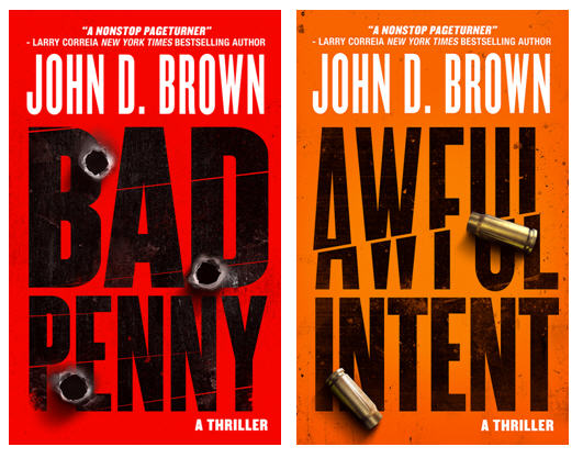
I think they say action thriller loud and clear and will easily stand out in a line-up.


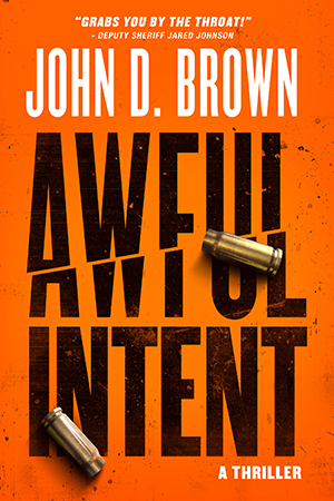
I really like the orange Awful Intent cover. Looks really good and definitely a sibling to Bad Penny.
Like the orange color. Makes my attempt at a cover for the book (which only you have seen, which is probably for the best) look feeble.
And congrats on the latest milestone – Draft 1 read-through finished! Huzzah !!
Glad to hear you both like it!