For those of you who are thriller readers, which two of the following would you be most interested in?
Before you make your choice, please note that they’re mockups. Unfinished. We’re just getting the idea.
Note as well that BAD PENNY is not a thriller of the spy, mystery, or intrigue type. It’s not military, cop, or FBI. It’s not fearful woman-in-jeopardy suspense. It’s not serial killer. It’s Lone Ranger Kicks Butt–a guy outside the law saves some folks and metes out justice. It’s action. And when thinking about tone, if you have the lighter KNIGHT AND DAY on one side and the very serious Jason Bourne or John LeCarre on the other, this one leans towards KNIGHT AND DAY.
Okay, let me know your choice. As dictator I may disregard all your votes, but at least I will feel like an enlightened dictator.


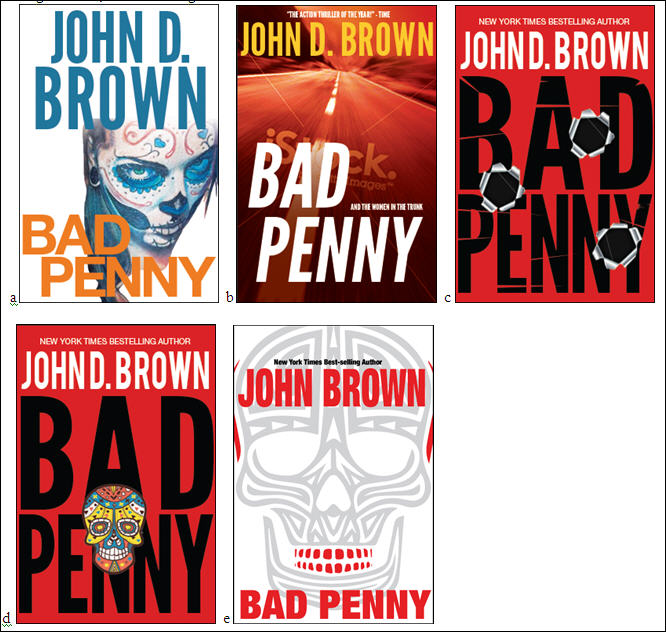


a
Yeah, A for me as well. The woman in the dia de la muertos makeup is my favorite. The rest of the cover could use a bit of background color to contrast against the starkness of her makeup, in my opinion, but it looks great.
I like your description of Bad Penny. The extra details are nice. I had in my mind an idea of what the book was going to be like, but your description makes it sound like even more fun. Excellent.
I prefer: D
A
(a) and (e) are the only contenders for me, but I think each needs some tweaking. I love the face in (a), but the text interferes with it in a clunky way. (e) is kind of Michael-Crichton-esque, but the red on the skull comes across as haphazard to me — maybe some red around the eyes and nose of the skull are needed to balance it out some more?
Overall I think (a) is my favorite, but (e) is more standard thriller genre. The others just look too generic to me and therefore not compelling.
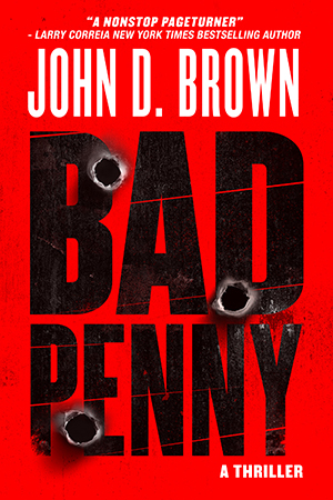
Thanks so much for the responses. I’ve gathered them here. I’ve gathered them there. I’ve gathered responses everywhere. And A and C have recieved the most positive reception. Followed closely by B and D, with E trailing in a distant last place.
BTW, A is an actual tattoo by Erio Tattoo of Santa Muerte that I came across in my research for this book. It’s on some dude’s upper arm. You can find the original photo on DeviantArt. I absolutely love it! And was so happy to receive permission to use it on the book.
But as I’ve done this informal testing it appears A has also caused a number of people to also think the book is primarily about voodoo or horror, which is not something I want to communicate.
It’s been a very difficult choice for me. I like ALL of these concepts (Jared, e said Crichton to me as well). But we’ve decided to develop C. However, I am considering including a framed image of the tattoo inside the the book in the author’s note. I’m having such a hard time letting it go.
Thanks again for all your input! It’s much appreciated.
Maybe the little skull image could go on the spine between your name and the book title or something? Give it a little flare when it’s on a shelf.
That’s certainly an option. We have the back cover as well. We’ll have to see 🙂
A. I like it a lot.
I just went to amazon.com and did a search on “Bad Penny” and the first match that came up is a book of that title by Sharon Sala that came out about a year ago. The title confusion is unfortunate.
JohnW, true. But I think with a million books in the store, there’s bound to be issues like that. We’ll just have to make sure mine outsells hers and appears at the top of all lists (grin)
Definitely ‘a’. It jumped out at me. The others look like any other thriller/suspense novel cover art on the market.