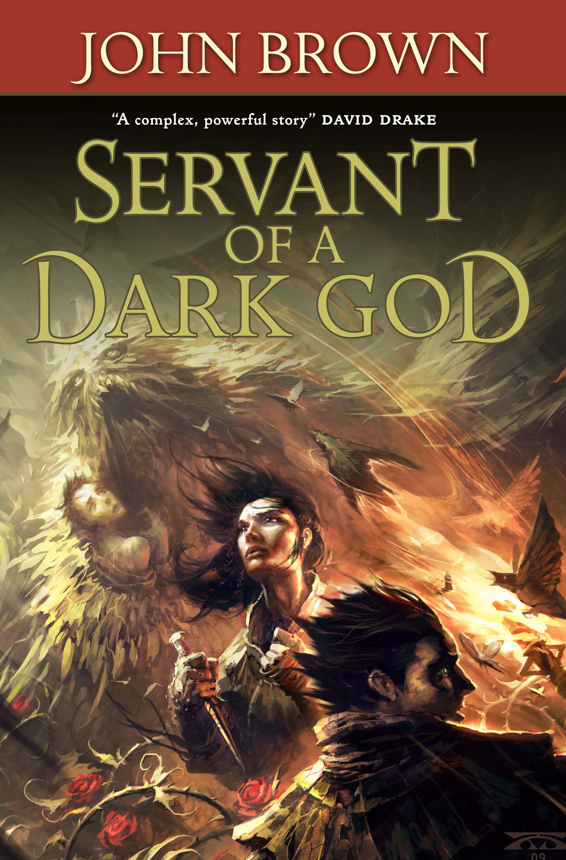
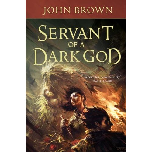
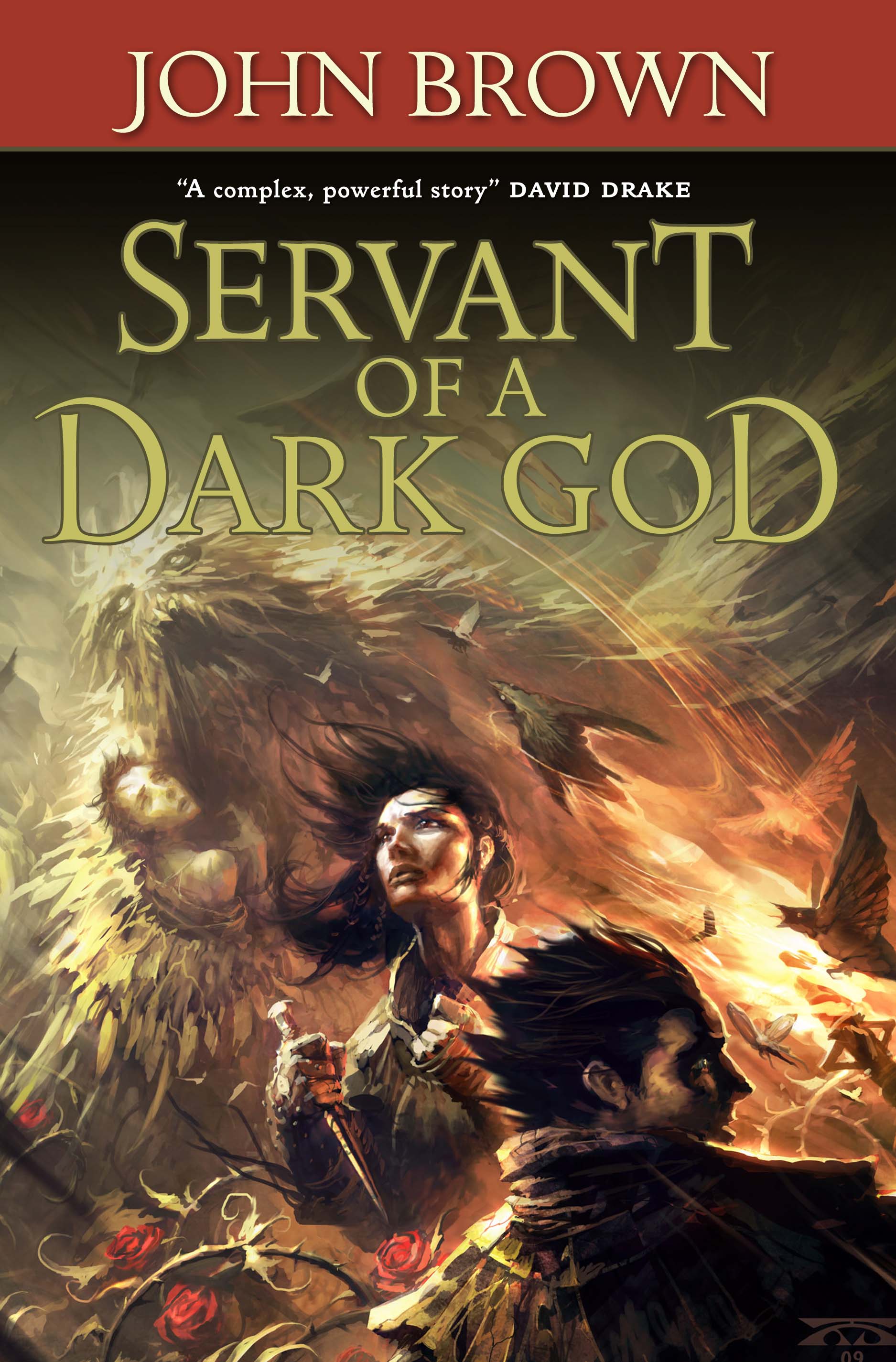
Final Cover for Servant of a Dark God
Shiny.
They moved the David Drake blurb to the side, lightened the lettering and moved things so the title wasn’t covering the top of Hunger’s head. At first I thought they moved the lettering, but they didn’t. It appears the shrunk Hunger a bit so we could see more of him. Small changes, but I think they make a significant effect. I think the overall effect is better. I like how Hunger looks more menacing in this one. Sugar is different. Don’t know which version of her I like better. I’m leaning to the original. Your thoughts? Either way, we luvs Tor’s art and production department. Here’s the before and after.