The cover illustration for SERVANT is finished!
(and there was much rejoicing.)
yea.
Actually, there was DANCING. Because I think the final piece rocks. The artist is Victor Minguez. Here are two of his pieces that I really enjoy.
The first is “Angel.” I love the bright contrast, the face, and the fact that there’s so much rich detail.

The next is “Champagne Havoc.” Again, a wonderful face, but also an awesome idea (a robot carrying a woman in the palm of its hand), and then the lines and chopper give the whole piece a lot of energy.

Click here to see other works in his portfolio.
So we kicked the project off by me sharing the goals I had for the cover and tons of reference on everything from color scheme to character costume. I asked Victor to develop some concepts for an ensemble of Hunger, Sugar, and Talen as well as some for the cave scene towards the end of the book. He came back with these sketches.
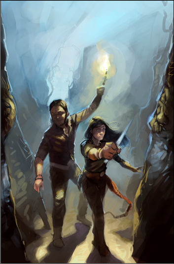
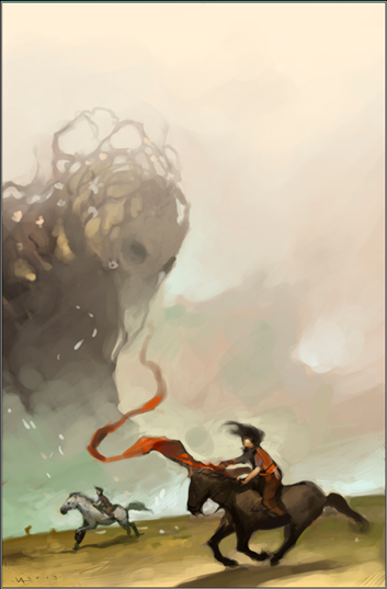
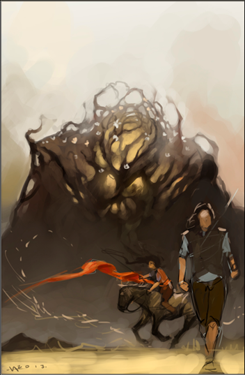
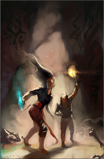
I liked the first because it would allow us to see the figure’s faces more clearly. And there was a lot of interesting detail with the cave. Look at the roots by the entrance. I also liked the structure. I liked the third because it included Hunger, and Victor was taking Hunger in a new direction. I also thought we could do some neat things with the energy of Sugar on the horse and that long sash. The fourth one, however, just felt right. It had so much potential energy. I was immediately drawn to the body language. And so this is the one we decided to develop. Then one of my beta art viewers suggested moving closer and putting in more strong diagonals. It was a perfect idea. Victor agreed and came back with this.
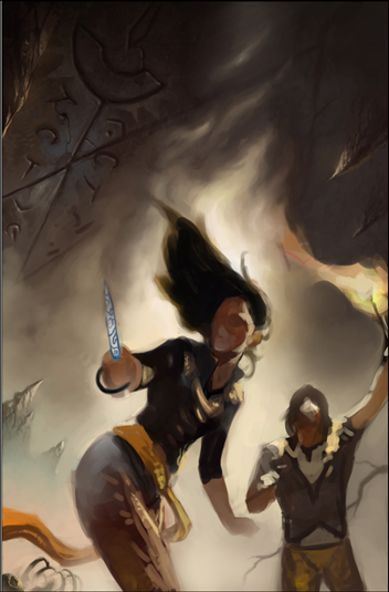
I liked the lines of her stance but wondered if she needed something stronger with her legs. Victor adjusted, but my idea just wasn’t an improvement.
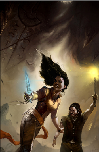
So we decided to stick with the previous version. However, this was all too dark. Way too much gray. When looking at things in thumbnail, the cover has to pop. I shared more reference images. And Victor went back and delivered this.
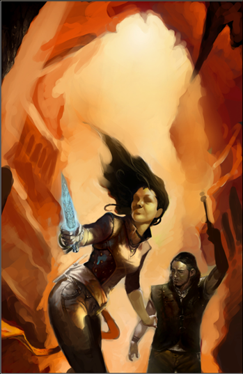
Boom! That was exactly what I was looking for. Bright, dynamic. However, we needed a more neutral bit at the top for the title and author’s name. And the brightest spot had to be behind Sugar to draw the eye to her. Here was the next version.
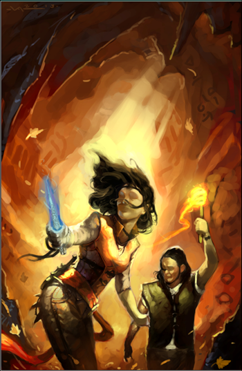
At this point I started to dance. This was IT! There was a lot going on here. We had the high contrast I wanted. We had the energy. The wind with the hair and leaves and sash and torch all add kinetic energy. As do all the diagonals. Notice as well the cave details–we have hints at previous habitation, runes, and some interesting contrast with the dark foreground. I had shared a number of N.C. Wyeth and Tim and Greg Hildebrandt pieces as reference, and I think this captured elements of those and gave them a new twist. Note as well the sharp projections on Sugar’s behind. Victor put them in there purely for aesthetic reasons. He had no idea what they were. I loved them. He loved them. They worked. We would just have to make them make sense.
After a few more iterations, he delivered the final.
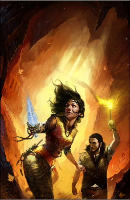
I think it’s gorgeous. And will advertise the book perfectly. In a few days I will reveal the final cover with title etc. Shortly after that, SERVANT will be available again to please English readers worldwide.
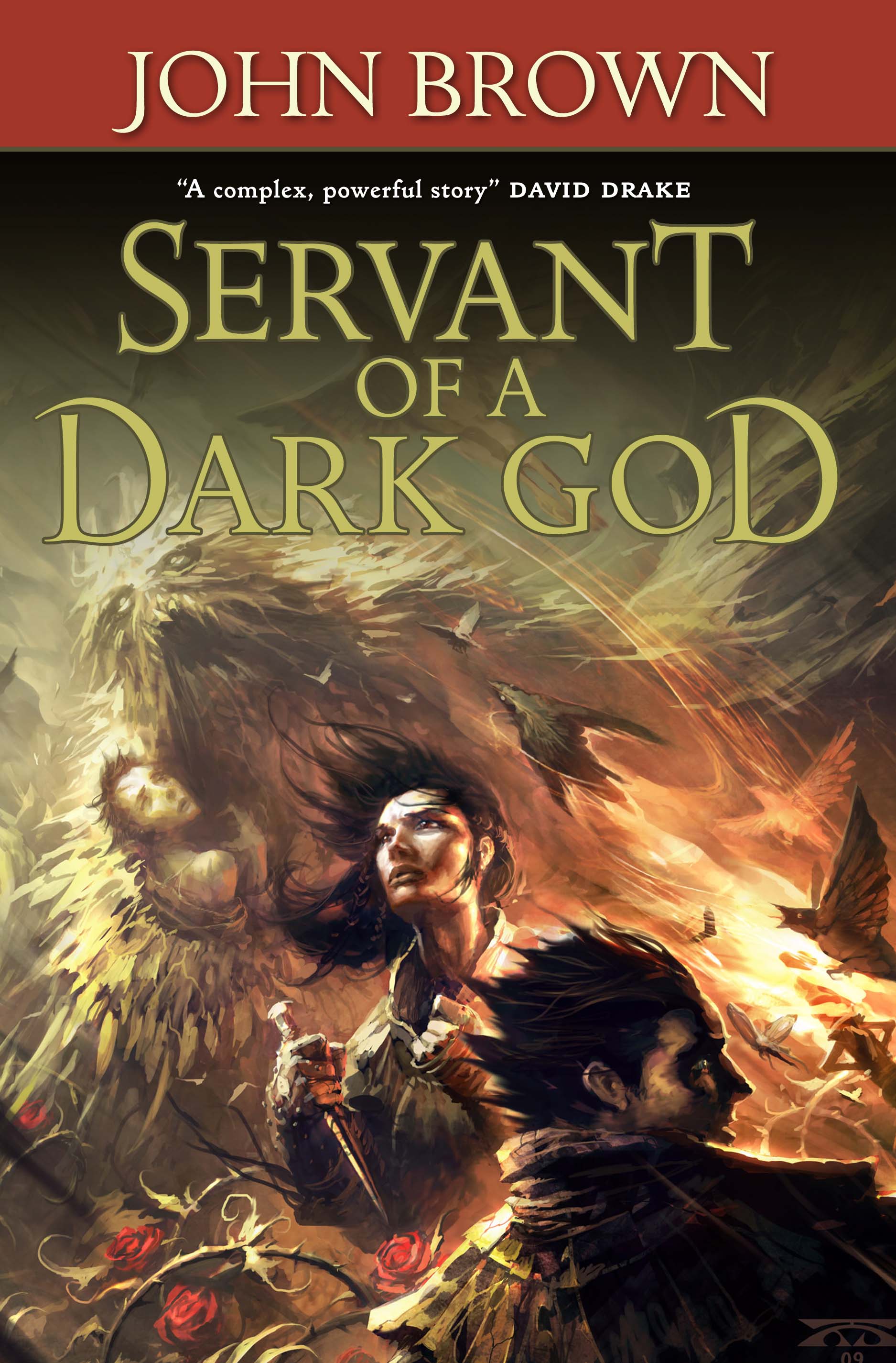

(Then I remembered I’d given up writing books about bimbos with swords)
Now wait a minute,does that mean you have written some books about bimbos with swords?
Glad you are happy with your cover. I don’t know what a raveler is yet because your sample didn’t go that far. Oh and are you going to be doing a class at conduit in SLC pretty soon? The websites progran seems a little clouded from place to place. SO in one place I looked it, it made it sound like you would.
Thanks
Yes, I will. Right now I’m slated to teach on Friday night from 8 PM – 10 PM.
I love it, John. That’s a sweet monster in the back, and the roses are compelling, as well.
I probably won’t buy it, though. I was hoping for boobs like machine guns. 😉
Blast you, Hezekiah!
Actually, we’re coming out with book plate sticky notes and a crayon that will ship with the book. If you prefer the other style, you can put it over this cover. It will all be outlined and you can color it in.
Cover art looks great. I personally think bimbos are over-rated. No harm intended for bimbo-readers, if any.