Servant of a Dark God: Coming October 13, 2009

Tor Books’ production department has moved my book’s release date out one month. I’m getting so antsy to have it hit the stores, but October’s actually a better month, it being closer to the holiday season.

You still might be able to get it earlier if you pre-order. The books actually start shipping in the second half of September. But it takes a few weeks to get them out to all the stores.

Share

Similar Posts

  • NEWS: Finished line edit of Servant

    It took me 33 hours, but I just finished reading through SERVANT and marking the manuscript up with the line edits I need to make.

    Holy smokes, folks, but it’s going to be a bigger edit than I originally thought. I knew I wanted to resequence chapters 1-8 back to the way I originally intended them. I knew there were some typos. And I knew I needed to add some content surrounding Purity’s story. But as I read I found that I was making line edits on almost every page.  For those unfamiliar with the term, you have basically four edits.

    • Content or story edit
    • Line edit
    • Copy edit
    • Proof edit

    The story edit is just what it says: you’re looking at plot and character. In this edit, you might add or cut whole chapters or story lines.

    Once the story is good, you do a line edit. In this edit you’re looking for how well the actual words on the page flow. You’re looking for parts where what you’re trying to say isn’t clear, where sentences or paragraphs are awkward, or where you haven’t been consistent. In this edit, you rewrite sentences and paragraphs. 

    Next, there’s the copy edit. Back in the old days, you had essentially three versions of the work. You had the original manuscript, which might go through many edits for the story and flow. Once it was good, the manuscript would be given to an editor who created a “copy” that could be used by the typesetters.  Of course, before you handed that over to the folks setting the type, you wanted to make sure it was clean because making changes in type is a pain in the butt. So in this edit, you’d go over it one more time, looking for typos and grammar issues. At this level, you fix words within sentences, although many times this edit will be combined with a line edit.

    Finally, there’s the proof edit. A proof was a copy of the work that had been set into type and printed. The typesetters would look at the their typesetters copy and then physically take metal sorts and mount them in a press to match it. To print it, they would ink the sorts and make an impression onto blank paper. That’s how stuff was printed. 

    Nowadays, you don’t need to manually set the type–you just print directly from document on your computer.  So you don’t have to worry about errors introduced into the text because of the typesetting. However, as many writers will attest, you simply do not see things on the computer screen that are obvious on the printed page. And so you always want to print out a proof and then edit it one last time for any errors in formatting or for small copy or line edits.

    So this last read was more or less a line edit. I did make some content-sized changes. And I did mark it up for typos and grammar stuff. But the bulk of the changes were line-level stuff, and I have to say I’m amazed at how many there are. I guess this simply means I’ve grown as a writer. But it is going to take some time to finish. I’ll then give the manuscript to my wife who is great with copy editing. And do another revision.

    I have to say I enjoyed reading the stories of Talen, Sugar, Argoth, and Hunger again. Some of the events had dimmed with time, and I was delighted to read them again. Parts of this book just make me so happy. With a couple of them I was all, dang, this story is awesome!

    ***

    Still working on the cover design for the Dark God books. Hope to finalize the basic structure this week and commission an artist. I’ll post the process and get your feedback as we go.

    Share
  • The Cover Illustration for CURSE

    This is a story of how things went wrong and then went right. It’s also a cautionary tale for indie authors who want to direct their own art.

    Victor Minguez did the art for Servant, which I think is awesome, so I naturally wanted him to do the art for the second book as well. I started as I have before by working up a detailed creative brief which stated my goals, suggested color scheme, identified the scene I thought we should illustrate, and provided plently of reference images. The goals for this illustration were that it had to say epic fantasy, fit with Servant, have energy, and pop in thumbnail.

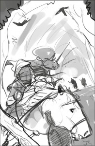
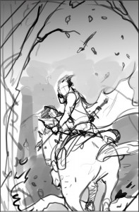
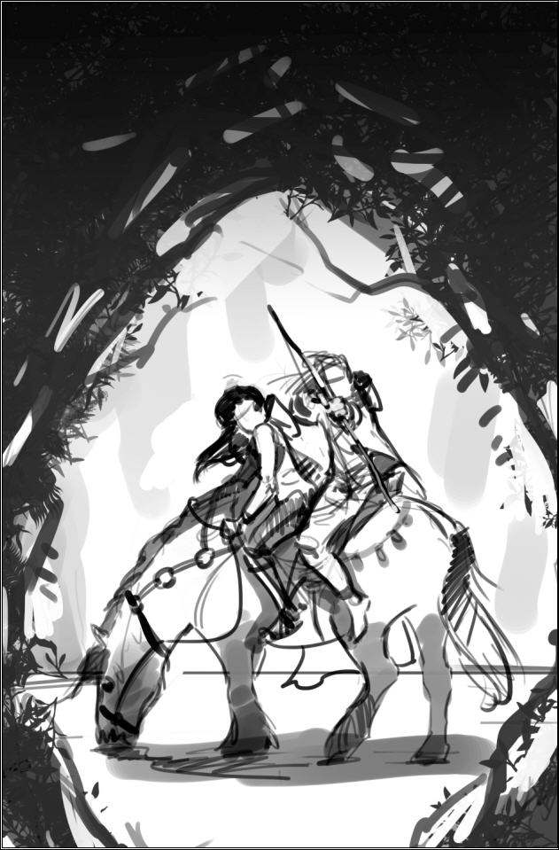
    Victor came back with these sketches. I thought all of them were great concepts. The framed and rear view depict the moment before something dramatic is about to occur, as if something dangerous is out in the woods. The front view was well into a dynamic scene. I loved the contrast of the framed sketch, but was drawn most to the dynamic rear view. (Click on any image to see it full size.)
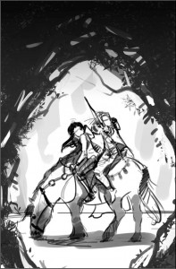
     CurseSketchFramed CurseSketchFront CurseSketchRear

    I knew from the last project that we needed to make sure that the illustration would integrate with the title and author’s name. And because we are going to brand the series, in part, by keeping the author name and title in the same position on all the books, I thought we needed to zoom in a bit. I tried various angles. Ultimately, we decided to flip it.

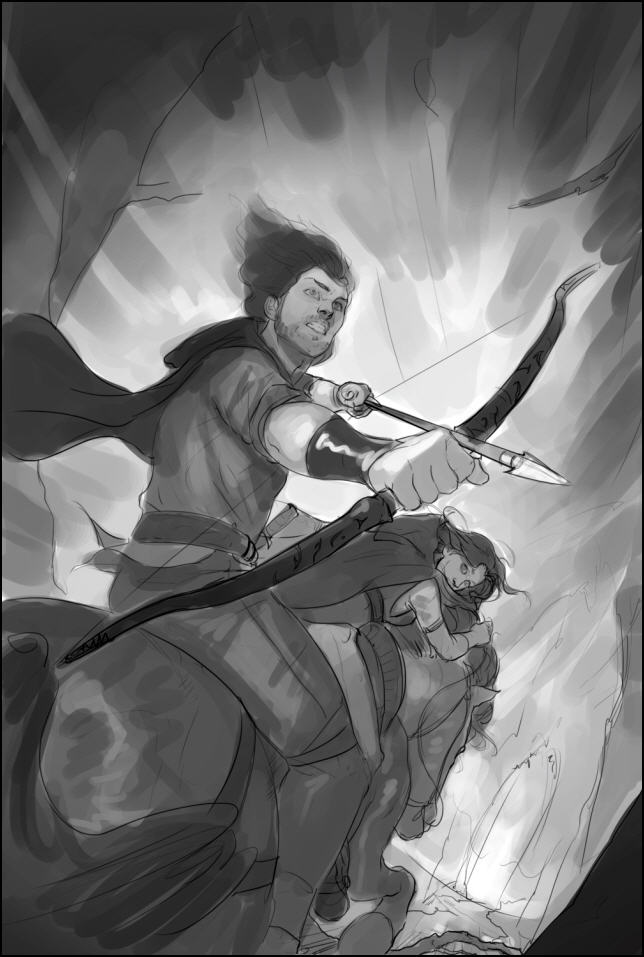
    Victor then did another sketch with values to nail it all down. I thought this sketch was awesome. There was energy. It said epic to me. I was drawn immediately to the characters. I thought we had great contrast.
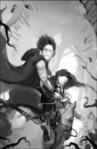
    CurseV1SketchValues

    So the next step was to start laying in some colors.
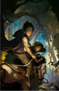
    CurseV1WIP1

    And here is where the cautionary tale begins. I think I have a good eye. I know when something is working. But I’m not a trained artist. And I’m not a trained art director. Which means that while I have a feeling of where in general I might want something to go, I don’t know exactly what will get us there. And that means that sometimes I’m going to do a lot of, let’s try this, nope that isn’t it, let’s try this instead. Naw. Maybe this. And as I begin to ask the artist to tinker, the risk of me directing us into something that doesn’t work, and forcing the artist to work way over his or her budgeted hours increases dramatically. It also sometimes increases the risk of me losing sight of the end goal.

    I keyed in on my desired color scheme. But a color scheme is a means to an end. I got trapped thinking about the means, not the end. So I asked Victor to get more gold and blue. Open it up.
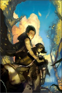
    CurseV1WIP2Brighter

    Can you see me taking us away from the original concept? Not necessarily a bad thing. Art is often iterative. But I wasn’t done. I wanted color. At least, I thought I did.

    CurseWIP3ColorBright

    Do you see where this is heading? But I had this idea and was determined to see it implemented . . .

    CurseV1WIP4

    Well, we got to this point. The artist was delivering what I’d asked. And it was shaping up to be a fine piece of art, but it was totally wrong for the book and genre. What’s more I was driving the artist nuts. For every change he’d make, I’d bring up two more. I was way too far into the details. I’d  taken us way off course. And burned up all his hours doing it.

    What do you do?

    Luckily, I know someone who IS an experienced illustrator, who has worked on many different projects, and who was willing to step in as art director. Most importantly, with me out of the picture, the artist was willing to give it one more go with this new guy at the helm.  I stepped completely away from the process. Here’s what happened in the words of the director (who wishes to remain anonymous).

    ART DIRECTOR TO THE RESCUE

    The goals for this image were to say fantasy and be eye grabbing at a very small size. I was brought on to accomplish those goals. I think we all felt that the image was too peaceful. It contradicted the feeling of danger we were going for.

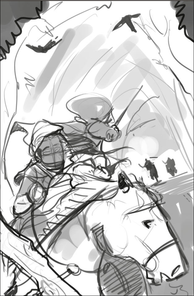
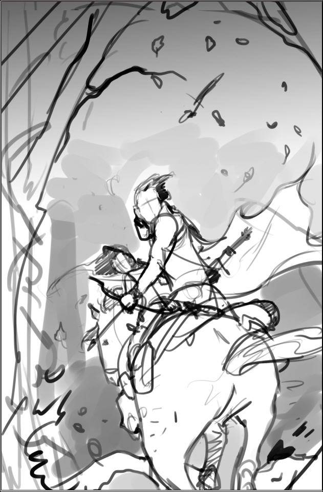
    Take two: John gave me the old thumbnails that Victor had. At first I looked to see what could be salvaged from the old completed painting to use in the new, but ultimately Victor came up with a more dynamic sketch, and we decided to go for it.
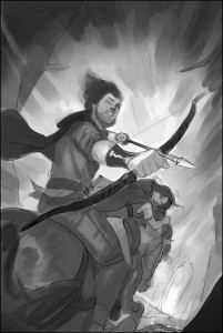
    CurseV2Sketch

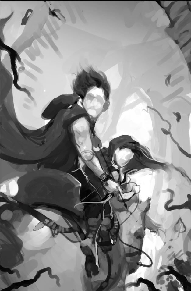
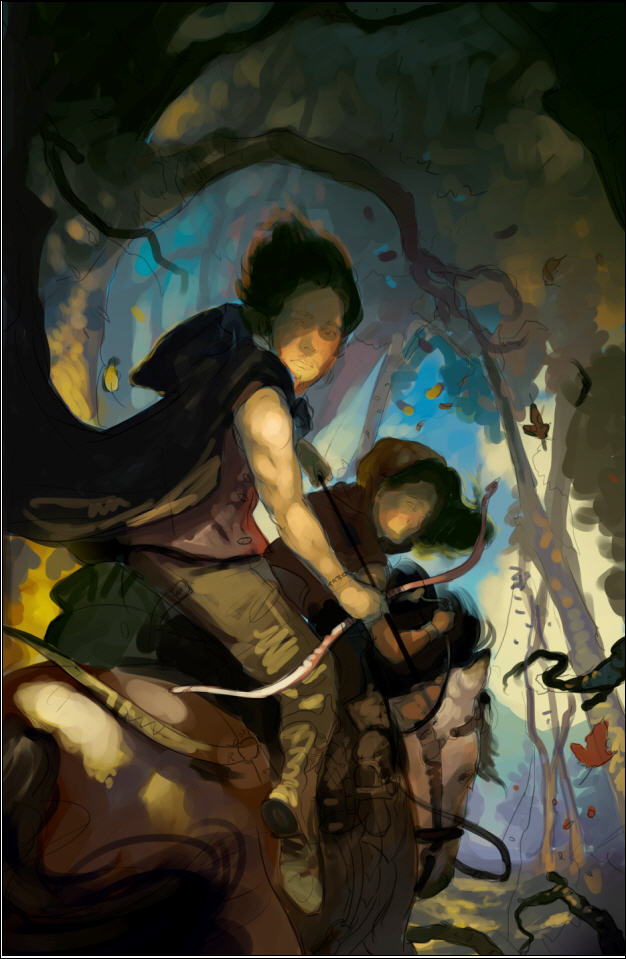
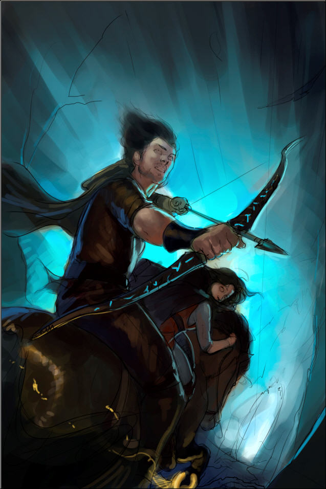
    So we started there. The processes was an iterative one. Victor blocked it in, and we nailed down the values/black and white image. Values are the underpinnings of a painting; you want that to work on an abstract level first. Meaning if you didn’t know that it was a painting of Talen and River riding away on a horse, would the value patterns still be both striking and pleasing? There is no point in proceeding with a painting if either the drawing or the values are failing. After that came the color study. 
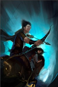
    CurseV2ColorStudy

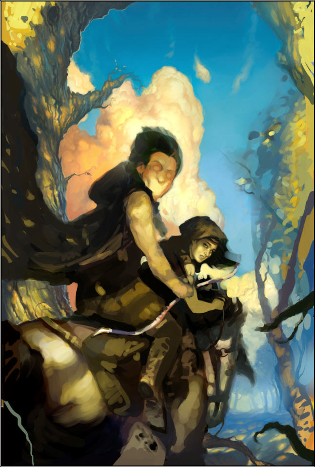
    Once nailed, we went to finish.  Victor really put his heart into this and it turned out awesome!  He’s got great talent, and is a pleasure to work with.
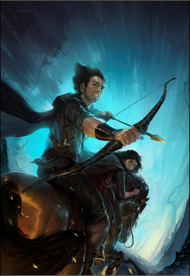
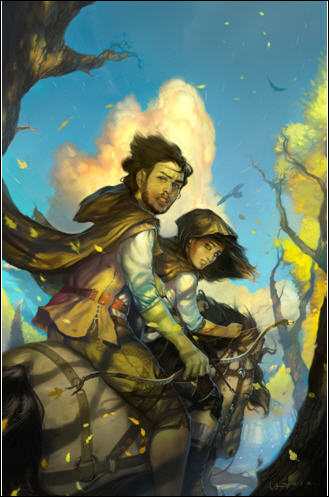
    CurseV2FinalV1 

    JOHN AGAIN

    Are Minguez and Un-named Director good or what! It says epic fantasy. It says action. It has the level of darkness and energy we need. And it looks like it belongs with the cover of Servant. It’s going to work great, and I think the cover will pop in thumbnail, especially when we add the title (white, like Servant) and author’s name (probably a bright color taken from arrow head or horse shoe).

    So lessons learned from this and the previous covers:

    1. Authors are not artists. Just because you know in general what you want doesn’t mean you have the ability to direct a project the way it should go. If you’re not careful, you will shipwreck the project.
    2. Having an experienced art director on board can do wonders.
    3. Keep the broad end in mind; try your best to let the artist focus on the means to that end. This doesn’t mean you don’t provide a lot of image reference up front, but you’re paying the artist for a reason.
    4. It’s helpful for the artist to estimate a total hours they’ll work for the project, even if you’re not paying them an hourly rate, and then keep you up-to-date on hours worked. This way you are forced to use their time wisely. You only have X hours to spend. Spend them on dumb changes, and you’re going to end up with something that’s half-baked.

    And now a mystery.

    I want you to look at the final image again. It’s not actually the final, final image. We had to ask the arist to make one more change because something was off. I will give you a hint. The change had to be made in the lower 1/4 of the image. Look at the image and see if you can find it. Do you see it?

    In the next post about this art I’ll both reveal what needed to be changed and tell you something about this artist that I think you’ll find both inspiring and amazing.

    Share
  • First draft of Bad Penny finished

    Folks, this book was a blast to write. I feel like I did when I wrote “Loose in the Wires.” Here are my stats.

    • Pre-draft work: 135 hours
    • First draft: 252 hours
    • Total: 387 hours
    • Words: 93,131
    • Words per hour for draft: 362 (holy crap, that’s glacier speed!)
    • Chapters: 29
    • Words per chapter: ~3,100

    I’m surprised at my drafting speed on this one.  I’m usually between 500-600 words per hour. Of course, there were a few spots where I ran into huge gaping holes in my invention.  For example, at the end of June I finished the climax. But I couldn’t write the last two chapters, which usually take no time at all, because I realized I knew nothing about the criminal justice system.  I knew TV generalities, but not the kind of detail I need.  Not enough to envision the last 5,000 words.  So all my writing time in July was spent researching.  There were a couple other invention stops earlier on.  So that’s my excuse.  Let’s hope the next one goes faster so I’m not totally embarassed.

    If I were full time, I could have finished this in 10 weeks. As it was, I started drafting in January.  My goal is to write two books a year. I’m not going to make it at this speed.  Let’s see how book 2 goes.

    Here are my next steps. I’m going to let BP sit for three to four weeks to cool.  I’ll then read it and revise.  Then it goes out to my readers. I hope to be shopping this one around by the end of September.

    In the meantime, I’ve already been noodling around with the ideas for book two in this series. My goal is to finish the working outline while this one’s cooling off.

    Share
  • Cover art for Servant of a Dark God

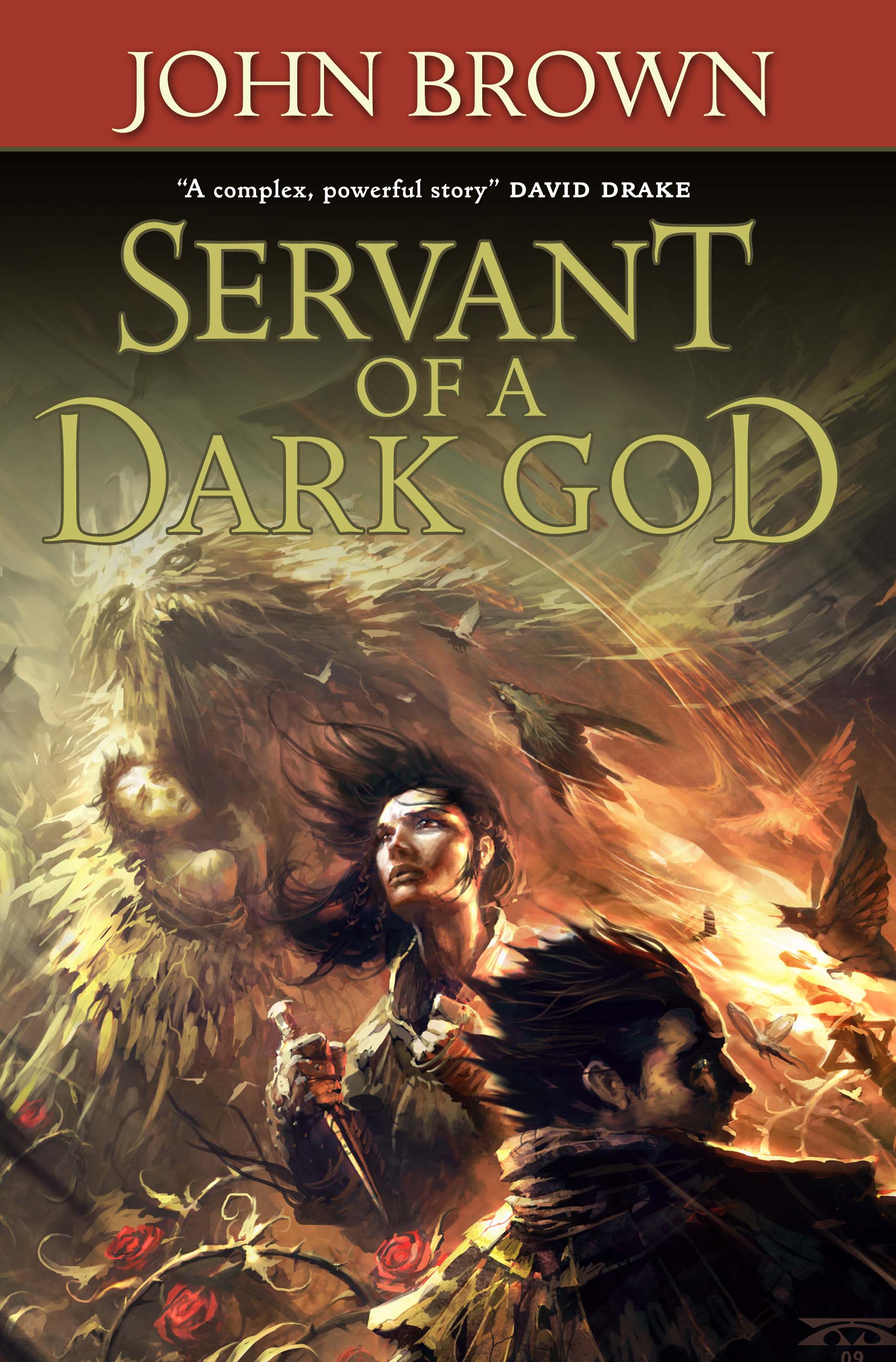
    servantdarkgod_comp

    I just got this from my editor. My first reaction was what?–No bronze brassiers, naked thighs, or gravity defying breasts?! I’m ruined! Then I remembered I’d given up writing books about bimbos with swords (alas, I really had some terrific mosquito scenes). 

    Folks, I think Swanland’s style is gorgeous, and I hope readers find this particular cover compelling. Click on it to see it full size. There are many things about this cover that I like, but one cool thing about the content of the illustration is that he worked in Sugar with the raveler. Those are, to date, my favorite weapons ever. In fact, Sugar herself looks, well, strong, beautiful, smart. Dang! Who wants to write about a bimbo when you’ve got a woman like that?

    (Of course, a bimbo with a sword could make a very good Legally Blonde meets Lord of the Rings. Humm. I’m tempted…)


    .

    Share

One Comment

Comments are closed.