News – updates on books, events, appearances, etc.

  • Awful Intent Update

    I’m almost 90% done with the second draft. I had planned for this book to be out in August. But life threw me a nice big curve ball this July. And then another in September. However, the man is now back, and we’re humming along. A number of fine folks have volunteered to be beta readers, and I expect the edits for their comments to go smoothly. Frank’s new adventure will be out just in time for the holidays.

  • United Authors Association Conference Oct 24th!

    UAACon1.5

    The United Authors Association is holding a fiction writing conference October 24th in Springville, Utah, and it’s free to the public!

    The conference schedule has some great presentation topics on it by authors who are delighting a lot of readers as well as an editor, agent, and a magician.

    I’m going to be presenting on the fundamental core of story–“Scene and Sequel”–expect we’ll be replacing those two terms right off that bat. Hope to see you there.

  • Awful Intent Cover Reveal

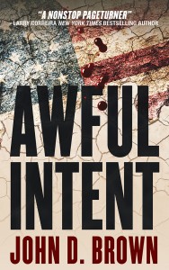
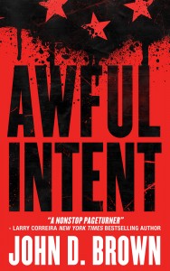
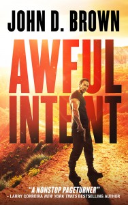
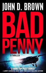
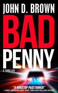
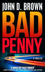
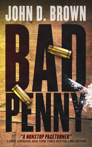
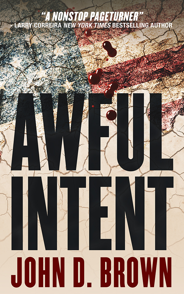
    For Awful Intent, I looked around at different cover design shops and decided to use Damonza. I sent over the brief, and we began. What I needed was a cover in the same style of Bad Penny. A match. I also told Grady, the designer, that if he did something new with Bad Penny, I might consider it.

    He sent back these.
    PennyB  Intent1

    Intent2  Intent3B

    I loved what he did with Bad Penny. But it was nowhere near what we’d done with the original. And none of the others matched either. And that was a problem. I need all of the covers in the series to look like siblings.

    We went back and forth with a number of iterations. Then decided to focus on Bad Penny.
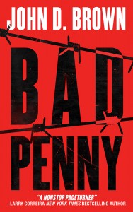
    Penny2B  Penny6B

    Penny7  Penny8

    And then I realized that I was falling prey to shiny object syndrome. It’s the bane of my life. There were all sorts of great ways to approach the cover, but I had already spent hours sorting through all that with the Bad Penny original. And the cover must be doing okay, because we sold lots of copies last year. I decided for everyone’s sanity to stick with the original decisions and parameters. That meant:

    • Bold, action-thriller colors
    • High contrast
    • Big fonts
    • Some texture
    • And some small element over top

    But I was still having a hard time clarifying in my mind something that was eluding me. Luckily I was in Cedar City for the Shakespeare Festival at the time and having lunch with Dixon and Linda Leavitt. Dixon pointed out that I was waffling between a literal and symbolic approach. Once he said that, I could see exactly what he meant. For example, the Bad Penny in the first batch was painted on a board. It was more realistic. The red Awful Intent was more symbolic. He also pointed out that I had used a small element in the original. With that clarity, we went back to work.

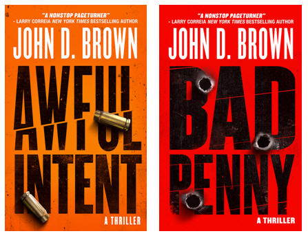
    I’m very pleased with the finals (BTW, I’ll be tweaking the text above my name in Awful Intent; so that one isn’t final-final yet).
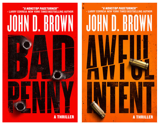
    BadPennyAwfulIntentFinal

    I think they say action thriller loud and clear and will easily stand out in a line-up.
     

  • Awful Intent Update: Climax Finished

    The first draft of the novel is essentially finished. I have two chapters left–one that confirms the resolution of the A story, and one that wraps things up in the B story. I am so excited to let this sit for a week or two, then come back to it with fresh eyes and get the second draft written. That draft will go out to my beta readers. And while they’re reading, I will be developing the idea of the next novel.

    These last two weeks, I have been applying the techniques used by sports psychologists to enhance professional- and olympic-level sports performance to my writing sessions. I’ve noticed the difference. And it’s been very good. I’ll be describing what that is in a future post.