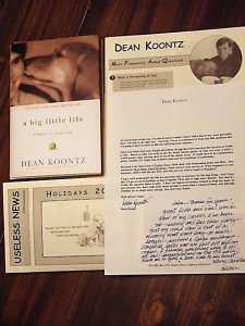
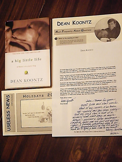
 So after finishing The Husband I wrote a letter to Dean Koontz. I never expected a reply. Today I got a package in the mail. I picked it up, thinking it was a book from Amazon. The sender was Mr. Dean Koontz. What? Dean Koontz?!
I opened it up. There was a form letter folded in half over a book. The part I read said:
At certain times of the year, I’m able to answer readers’ letters with a line or two, more personally than I am able to do right now. Currently I’m so overwhelmed by book and film deadlines that I’m going to have to resort to this less than satisfying form response.
I’m all, cool, a form letter and a book! He then talks about how he reads virtually all his letters even though he gets over 10,000 a year. Then he says he’s included a FAQ and his Useless News newsletter which talks about his latest books etc. The last part of the letter I could see was:
I hope you’ll understand why this less personal reply is necessary for the time being. And I hope
So I thought, hey. The man sent me a book. Holy cow. Talk about your customer service. Then I actually cut away the plastic wrapping and unfolded the letter and saw, despite his busyness, he had indeed written a note.
John–thanks for your great letter and kind words. Most of my career, I’ve been told–subtly and less than subtly–that my world view is that of a minority that won’t long–or much longer–sustain a large audience. Worldwide sales now are past 400 million copies. I tremble, wondering when it will all end! Congratulations on the TOR sale! From me to you, a book close to my heart.
Merry Christmas!
Dean
Duuuuude! And it wasn’t some admin either. The last paragraph of the letter says:
For what it’s worth, the signature below is mine. I don’t use legions of monkeys trained to forge my name, in part because they don’t seem quite smart enough to learn what’s wanted of them; and although dolphins are no doubt smart enough, they don’t have hands.
The signature is in blue ink. The same hand as the note. By this time I was totally geeking out.
Dean Koontz. He’s like one of the top 10 most popular novelests in the world. I LOVE his stuff. Then I opened the book. He’d signed it.
To John–WOOF. Dean Koontz 12-18-09
At that moment I was in total fanboy heaven. And I don’t do fanboy or any of that other wussy stuff.
I sent my letter on December 14th. 2 days down. 2 or 3 days back. That means he read it almost the day he got it. What a class act. And I was expecting nothing. I only sent my original letter because I truly appreciated his books and had to let him know.
So I guess one of the next books I’ll be reading is his A Big Little Life: A Memoir of a Joyful Dog. I expect it will be great.
BTW, here’s the text of my letter.
Dear Mr. Koontz,
I just finished reading The Good Guy. Thank you. Loved the interaction between Tim and Linda. And the reveals of their back stories. Loved Mary and Pete. Loved the situation. Krait was interesting and horrible. But the thing that put me over the top was the ending. [SPOILERS DELETED] I finished and said, “Yes!”
Thanks for the thousands of hours you’ve put into writing that have allowed you to deliver these kinds of stories and characters who are interesting, funny, and, despite some flaws, deep down good. I appreciate your view of the world, a place where great evil can exist, but also people like Mary, Tim, and Pete.
Thanks for stories that entice me to be more. The Husband enticed me to be that kind of man for my wife. The Good Guy enticed me to be a man of courage. Odd Thomas, on the other hand, has inspired me to make heavenly light and fluffy pancakes. I know you’re not sermonizing, but that’s probably why the tales move me the way they do.
I’m a new author; my debut from Tor (an imprint of Macmillan) just came out this October. I’m working like a madman to learn the craft and produce. And it’s wonderful to be able to see someone like you at the top of his game, writing these kinds of stories and sharing these kinds of characters. I hope, when I get to the end of my career (big or small), that I will have been able to deliver suspense, laughs, and goodness as you have.
Sincerely,
John Brown
And now I hope I can not only be the kind of author that delivers stories like Koontz, but also one who isn’t one whit behind in graciousness with my readers.
A few years ago I was going on and on about a couple of authors whose work I love. It drove Nellie nuts. But she finally got over the eye-rolling stage. At least I thought she’d put it aside. However, on that Christmas she gave me a 4×6 inch piece of material that looks like a Persian rug with votive candles and the names of those favorite authors on little cards that had been folded in half, tent style. She thought that was the best joke ever. Yeah, until she caught me praying in the basement. (Actually, I never prayed, dang it! Why does it take me seven years to think up these comebacks?!)
Of course, when I rushed back up stairs after having opened today’s package, she sighed. “I guess this means I gotta make a card for Koontz now, doesn’t it.”
Oh, yeah. Votives for the man.

 It’s official. SERVANT is in grocery stores outside of Utah. Saber2gecko saw and purchased a copy in a




Man, do I wish i lived in Utah so I could come out and hang with you guys. If I thought I could find a job quickly I might consider moving.
Life The Universe & Everything is coming up in February. If you wanted to hang with Utah SFF authors, that’s probably the biggest event.