Similar Posts

  • Writing Update: Awful Intent

    Folks, I just finished the first draft of my working outline for AWFUL INTENT. I’m stoked. Lots of research and lots fun and sometimes maddening work to get to this point. Here’s the current version of the summary, which will change.

    Southeastern Utah. 30,000 square miles of red-rock desert and wilderness.  One of the least populated places in the United States. The perfect place to hide just about anything.

    Frank Shaw is just passing through. He was once an elite soldier, trained to see what others want to hide. Then he made some terrible mistakes and fell from grace. Except the old skills never went away: they were only heightened during his time behind bars. Which is why Frank notices the fearful woman in the McDonalds and the killer watching her. 

    Frank could move on. He’s got a life to put together and a sandwich to buy. But some things are more important than a Big Mac. Frank follows the man who follows the woman, and that one decision leads Frank to a ranch that isn’t a ranch and into a plot of awful proportions.

    When Frank and the strong female Sheriff from the small town a number of miles away discover the truth, they try to get back and call for help, but the rancher is on to them and sends a private army out to hunt them down in the wilderness. Frank and the Sheriff will need to use all their combined skills to survive. Because time is running out, and thousands of lives are at stake.

    My agent got back to me on BAD PENNY. I will be focusing on some tweaks over the next two or three weeks. Then we need to get that moving forward.

    Finally, I know some of you are wondering about the DARK GOD series. And why wouldn’t you be with my earlier post? Things haven’t been finalized. Soon, Grasshopper. Soon.

    Share
  • |

    Writing Update: 5/28/11 – Freewrites, Storylines, Proportion

    I finished the next chapter of my outline, which turned into three chapters. Hurray for making progress. However, I’m going to need to make more time on a weekly basis if I’m going to meet my goal.

    I’ve kept stats over the last four novels. My average is 500 words per hour during the drafting stage. That includes revising and doing quick researches etc. So sometimes I will write a smoking (for me) 800 or 900 words per hour. Sometimes I won’t finish a thing. When I’m all done it averages out to 500 words. I’m going to see if I can’t get 20 hours this next week and finish 10,000 words. 

    Addition to last week’s post

     Do you remember last week’s post about the process of making it come alive in my mind first? Orson Card illustrates this as he describes how he prepared to write a story in his essay “How One Story Can Give Birth to Another“.

    Spideysense, farmer’s faith, and freewrites

    Last week when writing chapter 7, I finished, but felt something was off.  Years ago I would have freaked about writer’s block.  I would have told myself I sucked because the chapter was glucky. But not now.  It’s a gift.  So I stopped and talked to myself in a freewrite.  I had farmers faith that if I just kept working on it, something good would result. 

    Here’s what I wrote in that freewrite. It’s an awful read for you, but it shows you just how sloppy and cryptic and freewheeling my freewrites are.

    Okay, so I’ve written the stuff below and I could tweak it, I guess. But I keep having this nagging feeling that it’s not good. It’s not a compelling villain. I think he’s creepy and evil. And, truth be told, I don’t want to make him into something other than what he is—a total thrall to the Glory and the mother. So as the “pet” of the mother, what else could he be called? I don’t know.

    I shall call you endless because you will be spared, you shall continue, whereas the rest will not. Blessing. Blessed. Grateful. What would you call a thing that did you bidding reliably? But enthralled. I am part of you, you are part of me, and so you may take my name.

    He WOULD think—I am not like them. I am GRACED by the Mother’s touch. I have taken her into myself. Or she has graced me and so I have become more than I would be otherwise. I am obedient.

    What else do you call pets or tools. Maybe that’s what she calls him. My skir master. The skir lord. My trowel. Harvester.

    He’s over the harvest. Reaper. Or he’s the one that supplies food. Supplier. Gatherer. Cook. Chef. Hunter. Provider. Butcher. Slaughter.

    So I like Endless with the whole part of him being part of her. But he could use that—”you’re just like us” “no, we are part of the XXX (what was the name I had for them?) endless. You are meat”

    Devourers, Mothers, Sublimes

    Okay, so do I go with Endless or Harvest Hope. Endless it odd, neat. What could I add to Harvest to do the same. Harvest Lord, King, Overseer, Meatman, Food provider, Feeder, Harvester, Harvest, Rancher, Collector, The Harvester. Harvest.

    I think when you’re raised, you get a new name.

    Rebellion.

    Soul collector.

    The Shepherd.

    Harvest Prime

    Bald Head

    Laughter

    Everlast

    DIVINES

    ID HIM AS THE MAIN HARVESTER

    RIGHTEOUS ANGER

    The issue was that his motive wasn’t working.  I had a feel for what I wanted him to be, and my Spideysense was telling me it wasn’t working, wasn’t interesting.  Thomas McCormack in his book calls this feeling for what you want in your story a “prelibation”.  What an odd term.  But it’s real. 

    “Prelibation.  The desire for a certain effect on the reader.  It may or may not be followed instantly by an intuition of what item of narrative will cause that effect, and it’s important to see that intuition and the prelibation it is trying to serve are not the same thing. The intuiting of the narrative that will produce the effect-wanted is the work of the imagination” (p153 The Fiction Editor, The Novel, and the Novelist)

    There’s more in his book. I recommend it highly. So, after that freewrite, I didn’t have a solution, but I’d pinpointed the issue, the prelibation. I took a break with kids into the big city. Came back and had my solution for a narrative that would do the trick.  Luckily, it was something I’d cut out of the outline. Back it went with some significant tweaks and was better than before.

    Storylines & the Size of this Presentation Phase

    For those who have read my series on suspense, at this point, the presentation of the problem for the main story and many of my sub-stories is complete.  Depending on how you categorize them, I have nine to eleven story lines (which makes it impossible to write this book in 100k words).  There’s one main story line that touches everyone—the Mokaddian threat.  Then there are other questions and issues I raise that set the reader up with the expectation for a resolution.

    1. Talen
      1. Mokad/Nashrud (external threat)
      2. Lusts (internal threat, mystery)
      3. Sugar (relationship)
    2. Legs: Vulnerability
    3. Sugar
      1. Talen (relationship)
      2. Urban (relationship)
      3. Ancestors (relationship, mystery)
      4. Mokad (external threat)
    4. Argoth
      1. Mokad (external threat)
      2. Nettle (relationship)
      3. Bone Faces (external threat)
    5. Eresh
      1. Flax (conflict relationship)
      2. The Creek Widow (relationship)

    So most of these story lines have been presented, although not all. It took about 30,000 words to finish the presentation phase. I’m estimating 170,000 words, so that a presentation phase of roughly 18%.

    There are a lot of story lines and characters to juggle. Sometimes I kick myself for having so many. Of course, I love them, despite the challenge they present. Nevertheless, I AM looking forward to writing that thriller with a limited cast.

    Share
  • The Cover Illustration for CURSE

    This is a story of how things went wrong and then went right. It’s also a cautionary tale for indie authors who want to direct their own art.

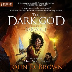
    Victor Minguez did the art for Servant, which I think is awesome, so I naturally wanted him to do the art for the second book as well. I started as I have before by working up a detailed creative brief which stated my goals, suggested color scheme, identified the scene I thought we should illustrate, and provided plently of reference images. The goals for this illustration were that it had to say epic fantasy, fit with Servant, have energy, and pop in thumbnail.

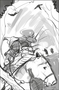
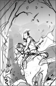
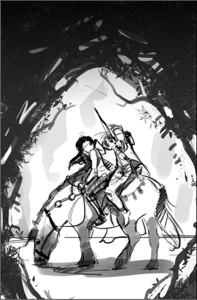
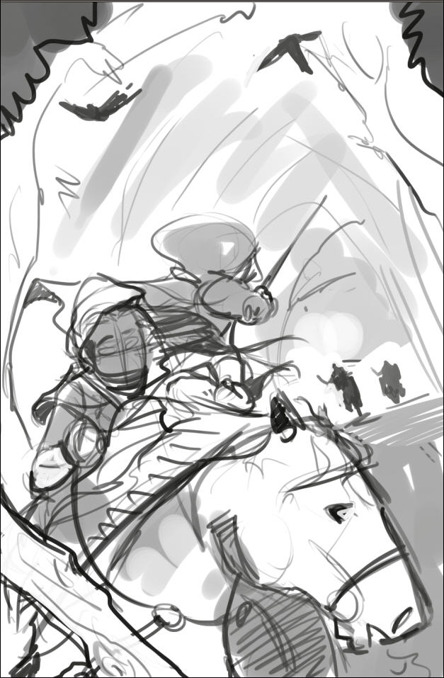
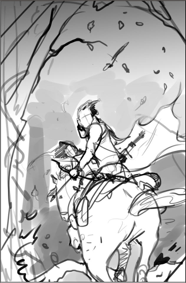
    Victor came back with these sketches. I thought all of them were great concepts. The framed and rear view depict the moment before something dramatic is about to occur, as if something dangerous is out in the woods. The front view was well into a dynamic scene. I loved the contrast of the framed sketch, but was drawn most to the dynamic rear view. (Click on any image to see it full size.)
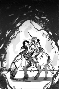
     CurseSketchFramed CurseSketchFront CurseSketchRear

    I knew from the last project that we needed to make sure that the illustration would integrate with the title and author’s name. And because we are going to brand the series, in part, by keeping the author name and title in the same position on all the books, I thought we needed to zoom in a bit. I tried various angles. Ultimately, we decided to flip it.

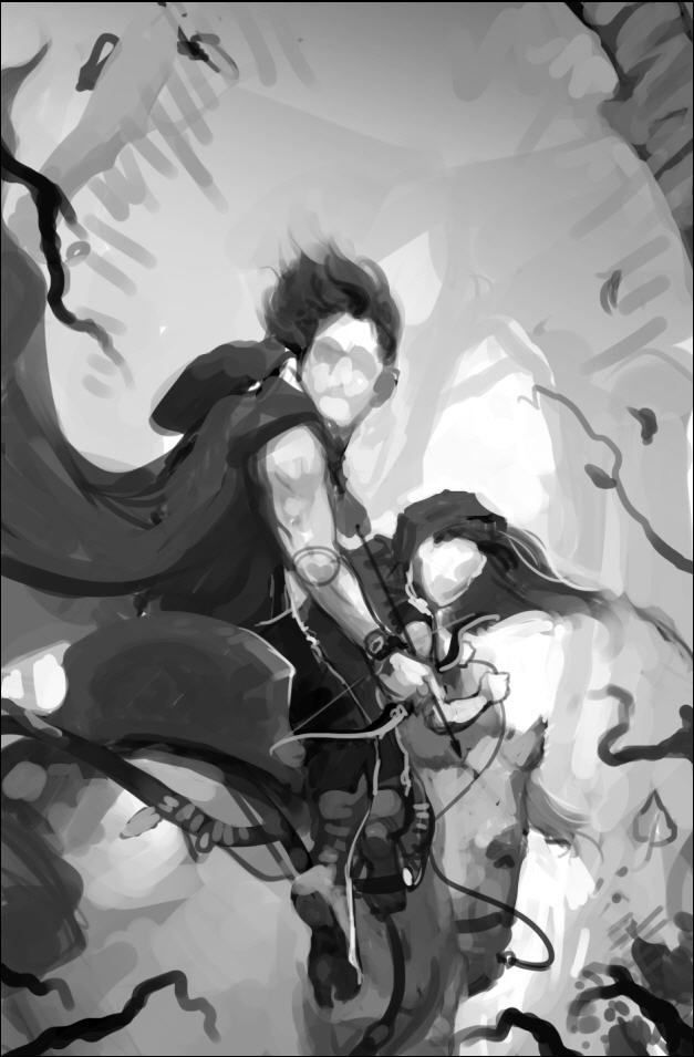
    Victor then did another sketch with values to nail it all down. I thought this sketch was awesome. There was energy. It said epic to me. I was drawn immediately to the characters. I thought we had great contrast.
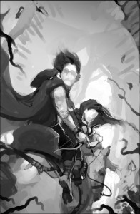
    CurseV1SketchValues

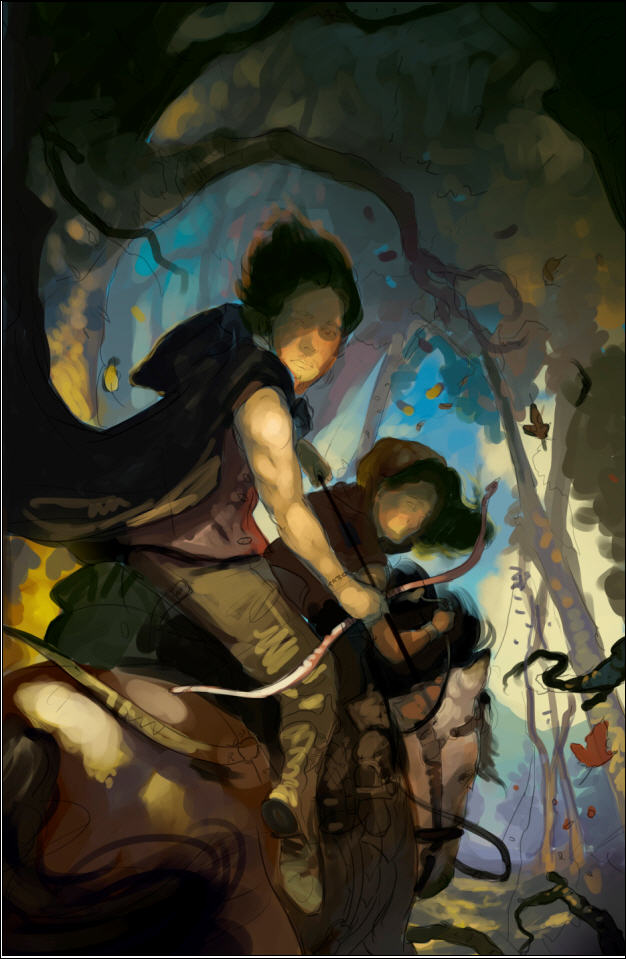
    So the next step was to start laying in some colors.
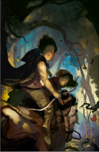
    CurseV1WIP1

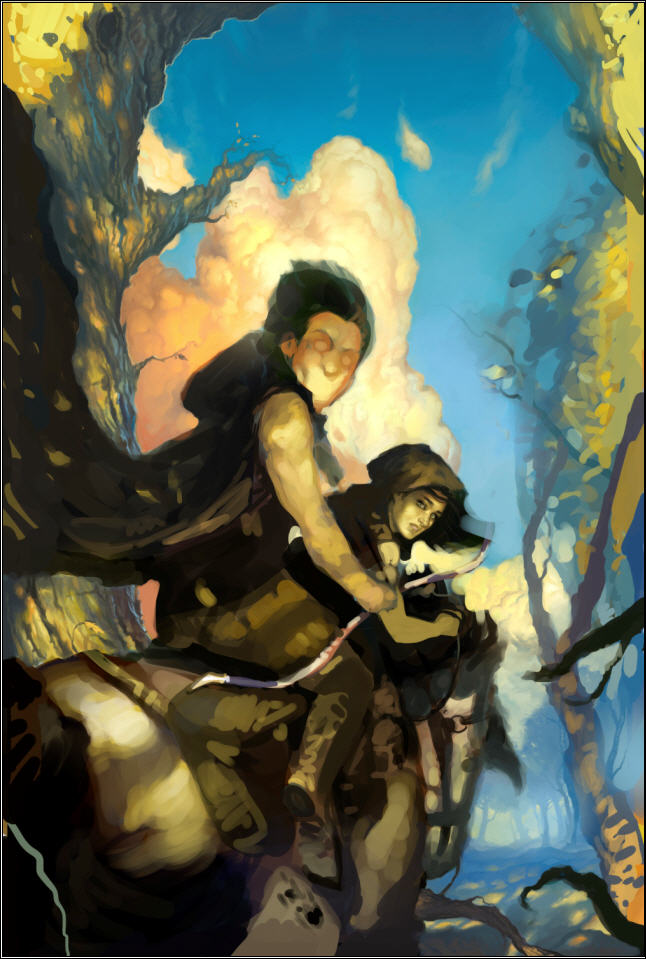
    And here is where the cautionary tale begins. I think I have a good eye. I know when something is working. But I’m not a trained artist. And I’m not a trained art director. Which means that while I have a feeling of where in general I might want something to go, I don’t know exactly what will get us there. And that means that sometimes I’m going to do a lot of, let’s try this, nope that isn’t it, let’s try this instead. Naw. Maybe this. And as I begin to ask the artist to tinker, the risk of me directing us into something that doesn’t work, and forcing the artist to work way over his or her budgeted hours increases dramatically. It also sometimes increases the risk of me losing sight of the end goal.

    I keyed in on my desired color scheme. But a color scheme is a means to an end. I got trapped thinking about the means, not the end. So I asked Victor to get more gold and blue. Open it up.
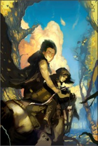
    CurseV1WIP2Brighter

    Can you see me taking us away from the original concept? Not necessarily a bad thing. Art is often iterative. But I wasn’t done. I wanted color. At least, I thought I did.

    CurseWIP3ColorBright

    Do you see where this is heading? But I had this idea and was determined to see it implemented . . .

    CurseV1WIP4

    Well, we got to this point. The artist was delivering what I’d asked. And it was shaping up to be a fine piece of art, but it was totally wrong for the book and genre. What’s more I was driving the artist nuts. For every change he’d make, I’d bring up two more. I was way too far into the details. I’d  taken us way off course. And burned up all his hours doing it.

    What do you do?

    Luckily, I know someone who IS an experienced illustrator, who has worked on many different projects, and who was willing to step in as art director. Most importantly, with me out of the picture, the artist was willing to give it one more go with this new guy at the helm.  I stepped completely away from the process. Here’s what happened in the words of the director (who wishes to remain anonymous).

    ART DIRECTOR TO THE RESCUE

    The goals for this image were to say fantasy and be eye grabbing at a very small size. I was brought on to accomplish those goals. I think we all felt that the image was too peaceful. It contradicted the feeling of danger we were going for.

    Take two: John gave me the old thumbnails that Victor had. At first I looked to see what could be salvaged from the old completed painting to use in the new, but ultimately Victor came up with a more dynamic sketch, and we decided to go for it.
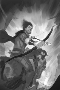
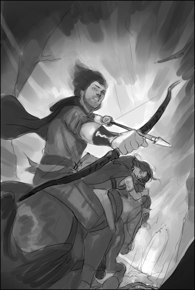
    CurseV2Sketch

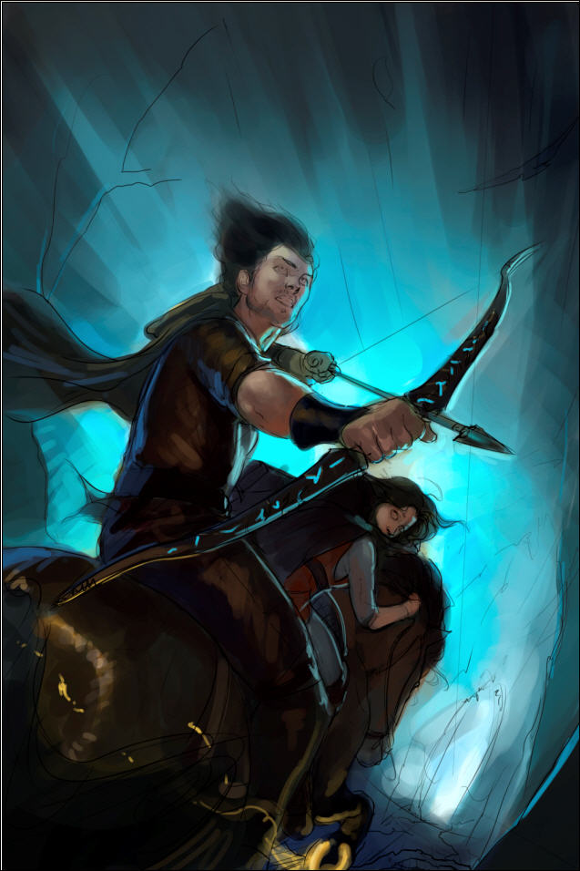
    So we started there. The processes was an iterative one. Victor blocked it in, and we nailed down the values/black and white image. Values are the underpinnings of a painting; you want that to work on an abstract level first. Meaning if you didn’t know that it was a painting of Talen and River riding away on a horse, would the value patterns still be both striking and pleasing? There is no point in proceeding with a painting if either the drawing or the values are failing. After that came the color study. 
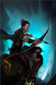
    CurseV2ColorStudy

    Once nailed, we went to finish.  Victor really put his heart into this and it turned out awesome!  He’s got great talent, and is a pleasure to work with.
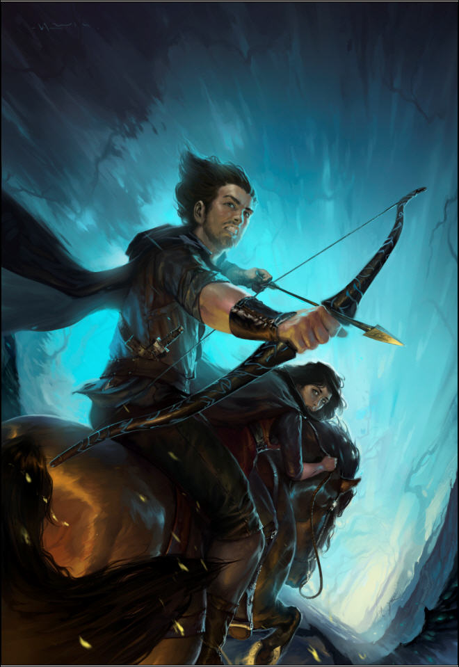
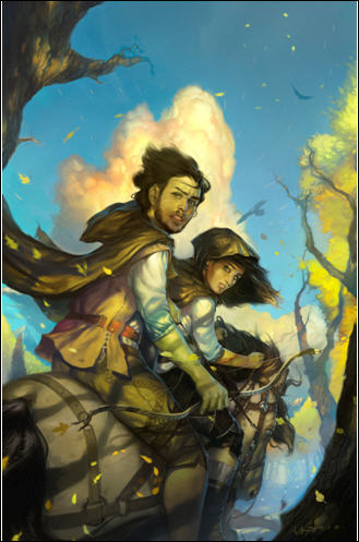
    CurseV2FinalV1 

    JOHN AGAIN

    Are Minguez and Un-named Director good or what! It says epic fantasy. It says action. It has the level of darkness and energy we need. And it looks like it belongs with the cover of Servant. It’s going to work great, and I think the cover will pop in thumbnail, especially when we add the title (white, like Servant) and author’s name (probably a bright color taken from arrow head or horse shoe).

    So lessons learned from this and the previous covers:

    1. Authors are not artists. Just because you know in general what you want doesn’t mean you have the ability to direct a project the way it should go. If you’re not careful, you will shipwreck the project.
    2. Having an experienced art director on board can do wonders.
    3. Keep the broad end in mind; try your best to let the artist focus on the means to that end. This doesn’t mean you don’t provide a lot of image reference up front, but you’re paying the artist for a reason.
    4. It’s helpful for the artist to estimate a total hours they’ll work for the project, even if you’re not paying them an hourly rate, and then keep you up-to-date on hours worked. This way you are forced to use their time wisely. You only have X hours to spend. Spend them on dumb changes, and you’re going to end up with something that’s half-baked.

    And now a mystery.

    I want you to look at the final image again. It’s not actually the final, final image. We had to ask the arist to make one more change because something was off. I will give you a hint. The change had to be made in the lower 1/4 of the image. Look at the image and see if you can find it. Do you see it?

    In the next post about this art I’ll both reveal what needed to be changed and tell you something about this artist that I think you’ll find both inspiring and amazing.

    Share