Warwick Castle

This last June, I stood outside Warwick Castle next to a longbowman and stared up at the massive structure. The curtain walls rose forty to fifty feet high. The great tower soared even higher—one hundred and twenty feet. But it wasn’t just the walls. 

The moat. Holy schnitzel, folks, the MOAT. 

On one side of the castle, the River Avon provided a barrier. On the other, a dry moat stretched forty to sixty feet wide and twenty to thirty feet deep. Standing at the bottom, you’d be staring up at seventy feet of turf and stone. That’s like staring up at a six-story building—with armed soldiers waiting at the top. 

My only thought was: good night, what kind of madman would assault these defenses? 

The answer, of course, is almost no one. Medieval sieges were usually about starving the defenders out, not storming the gates in a blaze of glory. Unless you had a trebuchet—which I also saw demonstrated that day. 

It was the kind of moment that makes a writer’s brain spark. Assassin, the fourth book in my Drovers series, is set in the capital city of Broniss, which bristles with towers and walls of its own. Standing there at Warwick, I realized: no sane army would attack such walls directly. Which is why the High King of Osson has other dark plans. 

Of course, Warwick had more than just military lessons. There was a falconry show where hawks, vultures, eagles, and even a condor soared just above our heads. Here’s a tip. If you go, sit on the benches, not under the tree. The benches are where you get the most flyovers.  

There was a dungeon tour that turned into a hilarious series of skits, complete with a plague doctor and a judge who convicted one of us.  

And afterward, we went into the city to a Thai place called The Giggling Squid (yes, that’s really its name). The food was amazing. 

It was a glorious day, and it reminded me that some of the best research often comes from first-hand experience. Although some things—like being pierced through with a sword—I’m happy to leave to my imagination. 

I’m back at the desk now, hard at work on Assassin. It’s turning into a terrific ride, and I can’t wait to share more soon. 

Here’s to Ferran, Sura, and Lagash—will they foil the traitor’s plot and stop the hashida’s creature, or will Ferran and the others fail and find all their dreams dashed to pieces?  

You’ll soon be able to find out.  

Sincerely, 

John 

Share

Similar Posts

  • Servant cover art

    The cover illustration for SERVANT is finished!

    (and there was much rejoicing.)

    yea.

    Actually, there was DANCING. Because I think the final piece rocks. The artist is Victor Minguez. Here are two of his pieces that I really enjoy.

    The first is “Angel.” I love the bright contrast, the face, and the fact that there’s so much rich detail.

    The next is “Champagne Havoc.” Again, a wonderful face, but also an awesome idea (a robot carrying a woman in the palm of its hand), and then the lines and chopper give the whole piece a lot of energy.

    Click here to see other works in his portfolio.

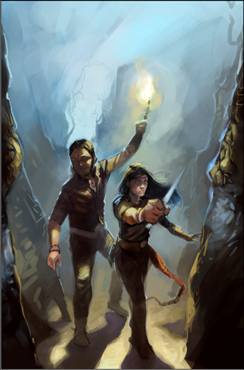
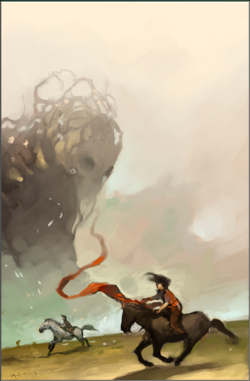
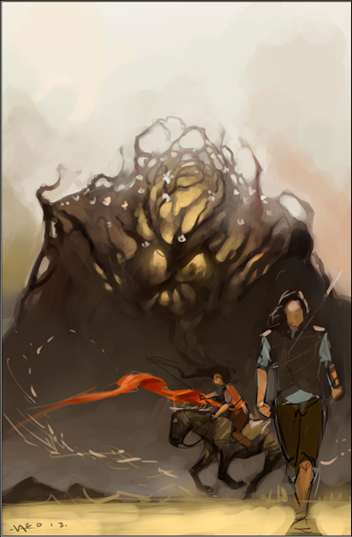
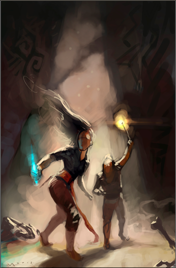
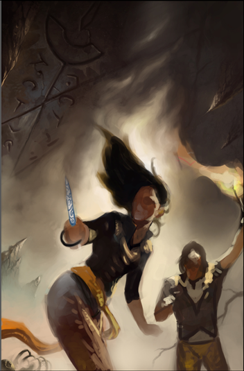
    So we kicked the project off by me sharing the goals I had for the cover and tons of reference on everything from color scheme to character costume. I asked Victor to develop some concepts for an ensemble of Hunger, Sugar, and Talen as well as some for the cave scene towards the end of the book. He came back with these sketches.

    Servant Sketch 1 cave Servant Sketch 2 horse ensemble

    Servant Sketch 3 ensemble Servant Sketch 4 cave

    I liked the first because it would allow us to see the figure’s faces more clearly. And there was a lot of interesting detail with the cave. Look at the roots by the entrance. I also liked the structure. I liked the third because it included Hunger, and Victor was taking Hunger in a new direction. I also thought we could do some neat things with the energy of Sugar on the horse and that long sash. The fourth one, however, just felt right. It had so much potential energy. I was immediately drawn to the body language. And so this is the one we decided to develop.  Then one of my beta art viewers suggested moving closer and putting in more strong diagonals. It was a perfect idea. Victor agreed and came back with this.


    Servant WIP 1

    I liked the lines of her stance but wondered if she needed something stronger with her legs. Victor adjusted, but my idea just wasn’t an improvement.

    Servant WIP 2

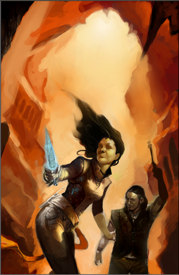
    So we decided to stick with the previous version. However, this was all too dark. Way too much gray. When looking at things in thumbnail, the cover has to pop. I shared more reference images. And Victor went back and delivered this.

    Servant WIP 3

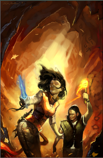
    Boom! That was exactly what I was looking for. Bright, dynamic. However, we needed a more neutral bit at the top for the title and author’s name. And the brightest spot had to be behind Sugar to draw the eye to her. Here was the next version.

    Servant WIP 4

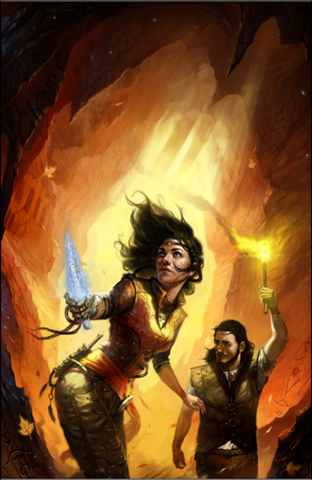
    At this point I started to dance. This was IT! There was a lot going on here. We had the high contrast I wanted. We had the energy. The wind with the hair and leaves and sash and torch all add kinetic energy. As do all the diagonals. Notice as well the cave details–we have hints at previous habitation, runes, and some interesting contrast with the dark foreground. I had shared a number of N.C. Wyeth and Tim and Greg Hildebrandt pieces as reference, and I think this captured elements of those and gave them a new twist. Note as well the sharp projections on Sugar’s behind. Victor put them in there purely for aesthetic reasons. He had no idea what they were. I loved them. He loved them. They worked. We would just have to make them make sense.

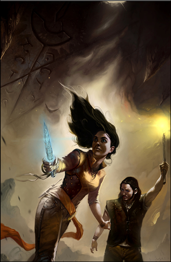
    After a few more iterations, he delivered the final.

    Servant Final

    I think it’s gorgeous. And will advertise the book perfectly. In a few days I will reveal the final cover with title etc. Shortly after that, SERVANT will be available again to please English readers worldwide.


    Share
  • |

    John Brown will keynote at American Fork Arts Council writers conference

    The city of American Fork is putting on what looks to be a great writer’s conference. I’m very pleased to announce that I’ve been asked to present the keynote speech.

    Keynote: The 3 Things You Must Learn to Write Killer Stories
    When: Saturday, April 25, 2009, 9:00 AM
    Location:
    American Fork City Arts Council
    31 N. Church Street
    American Fork, UT 84003
    (801)763-3081

    This looks like a great opportunity if you’re a writer. Here’s what the organizers envision.

    We have editors from Desert Book, Covenant and Cedar Fort coming to speak as well as National Book Award finalist Sara Zarr, Kristen Langdon, Ginger Churchill, Linda Bethers, Anita Stansfield and others. The goal is to provide a space for local writers to interact with local editors and local authors for inspiration, motivation and guidance in the tricky world of writing and publishing. To that end, the editors will be holding a query letter clinic using query letters from participants, which I think will be super useful. The editors are also speaking on what they want and don’t want as far as submissions, and the state of regional publishing in 2009 given the world upheaval. The authors will all be speaking on how they got an agent, how they got a book deal, what they have learned about writing.

    More info: American Fork Arts Council

    Share
  • Your input please

    Dear Readers,

    I currently have two options for opening BAD PENNY, my thriller that I’ll be sending to my agent next week. I’m looking, of course, for the most interesting first page. Please imagine you’re in a book store or browsing online. Tell me which option you find most interesting and by how much (a little more, a lot more).

    Thanks!! 🙂

    OPTION 1

    The two men had been keeping back, playing it safe, giving the woman plenty of room on the deserted interstate. It was just after five a.m., the sun still about an hour off. Hardly a soul out here. Just them and her driving in the dark, the two men waiting for her to make her mistake.

    Jesus Goroza, the man with tats running over his limbs like demons, thought she was FBI.  Dan Meese, the driver, the man with the prison scar on his neck, wasn’t so sure. Wouldn’t the FBI have sent backup at the first sign of trouble? Of course, maybe she’d convinced her bosses she was clear, and they’d pulled back the cavalry. If so, she hadn’t been very smart.

    Up ahead the woman slowed then took the exit to a small out-in-the-middle-of-nowhere Utah town called Coalville. In a big city, there would have been cars. There would have been some bustle. There would have been witnesses.

    There were no witnesses here. Not on these streets.

    There were hardly any homes in this town. Meese figured there were at most a few dozen, and they were all strung out along a main road that stretched for what looked like ten miles. All of them were dark. A bunch of hick farmers dreaming about cows.

    A brightly lit Best Western hotel and a Texaco gas station stood on one side of the interstate. A lone Sinclair gas station stood on the other. The woman came to a stop then accelerated up and across the overpass toward the Sinclair gas station on the other side, the one that you couldn’t see well from the interstate. The one she obviously thought might give her cover.

    “Bingo,” Jesus said.

    In a big city, the Sinclair would have been ready for business. In this no-nothing town, it was dark and locked. The pumps, of course, were on. And the station’s sign with a green dinosaur on a white background towered above the place and shone out into the fading night.

    But there was no attendant standing guard over the cash and cigarettes to observe the woman. No one to see her stop and start the pump. No one to see her go try the bathroom door around the side. No one to see the two men pull in just a few seconds later.

    Meese said, “Looks like the offerings to your White Lady paid off.”

    Jesus pulled the semi-automatic from the glove box.  “I told you she wanted mescal.”

    Mescal offered up in a glass five days in a row along with prayer and cigarette smoke blown into the Lady’s skeleton face.

    “They want her alive,” Meese said of the woman they were following.

    “She’ll be alive,” Jesus said.

    OPTION 2

    Frank Shaw sat facing the owner of Cowboy Donut in a back office heaped with stacks of paper in yet another job interview that was starting to swirl the toilet.  Trying to get a straight job as an ex-con was a lovely experience. Kind of like being dragged behind a bus.

    No matter how tidy you looked or how sharp your resume was, it all came down to two questions: “Have you ever been convicted of a crime?” and “What were you in for?”

    Frank knew it would be stupid to lie about either. First of all, he was trying to go straight. Second, any employer who didn’t have a carrot for a brain was going to run a background check. So there was no use trying to hide.

    The sun-wrinkled owner of the Rock Springs, Wyoming doughnut establishment was one Ms. Mary Rogers. She was probably in her fifties and had two-tone hair that seemed to take its inspiration from a badger—all bleached up on top and dark underneath.

    Ms. Mary had just asked the question, and Frank had dropped his bomb—voluntary manslaughter, a security job gone bad. He’d been protecting the wrong kind of noun for the wrong kind of people, which led to seven fine years in prison.

    Now came the fun bus part, the Judas-Priest-there’s-a-criminal-sitting-across-the-desk-from-me part. First interviews were like first dates. And Frank had basically told this date he had an Ebola monkey virus that would make her eyes bleed—would she now like a kiss? That, of course, was yummy to women everywhere.

    Ms. Mary narrowed her eyes. “What else am I going to find on your RAP sheet?”

    “That’s it,” Frank said. “Just the one unfortunate incident.”

    “Murder is a pretty big incident.”

    “Manslaughter,” he corrected. “Not murder.”

    She made a noncommittal sound and looked down to study his resume a bit more like maybe something new would pop up there.

    Share
  • |

    Learn plot, character, scene, and more this Saturday, Oct 9!

    All you Utah and mountain area writers & teachers, or those close enough to travel, I will be presenting and conducting workshops from 9:00 am until 4:30 pm this Saturday, Oct 9th as part of the Autumn Writers Conference sponsored by the American Fork Arts Council and the National Endowment for the Arts.

    The sessions I’ll conduct include:

    • Finding and Working With an Agent
    • How to Write a Story That Rocks: First Principles & Story Concept
    • Creating Characters that Rock
    • Plot
    • Writing Scenes: The Basic Units of a Novel

    There are four other tracks. Find all the details, including cost and contact info, on the organizer’s site: CalebWarnock.blogspot.com. I’m totally stoked for this. I’ll be sharing what I think are the Pareto factors in each of these areas — things I wish I would have known when I started and would have shaved years off my journey to publication.

    A number of other authors will be there including:

    • Annette Lyon (women’s fiction and a new cook book called Chocolate Never Faileth)
    • Josi Kilpack (mystery and suspense)
    • LeAnne Tolley (health and wellness)
    • Scott Livingston (poetry)
    • Caleb Warnock (self-sufficiency)
    • Loraine Scott (mystery)
    Share
  • |

    Update and The Shape-Changer’s Wife

    Assassin is moving along. I’m heading into the last quarter of the book, which is where the fireworks start. I appreciate all of you who have been so patient. My goal is to end this arc of the series with a bang. 

    In the meantime, I’d like to recommend a fantasy novel. I enjoyed it many years ago and recently reread it, finding myself swept away with as much intrigue and delight as the first time. 

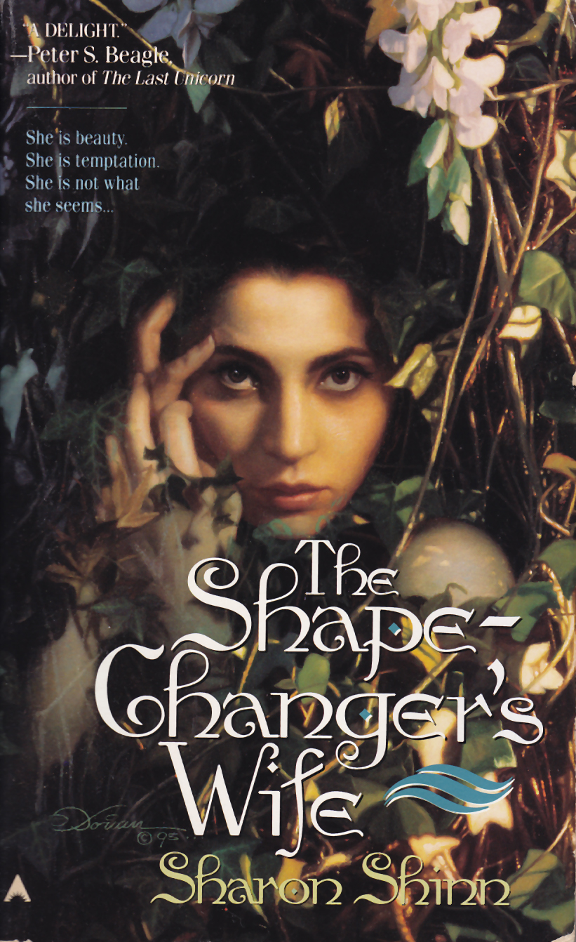
    It’s The Shape-Changer’s Wife by Sharon Shinn. 

    The story follows an aspiring wizard named Aubrey who is nearing the end of his training. He asks his mentor, the wizard Cyril, to teach him transmogrification—the art of changing form—but Cyril refuses. Aubrey protests. Cyril knows the spells. He has cast them himself. Still, he refuses. 

    Eventually, however, Cyril’s conscience gets the better of him. A well-rounded wizard should know every branch of magic, even the ones Cyril dislikes. So he writes to another wizard, a shape-changer named Glyrenden, and asks if he will take Aubrey as a student. Glyrenden agrees. 

    As Aubrey sets off, Cyril gives him a warning: “Learn everything he teaches you so well you can cast his own spells back at him. Glyrenden respects only those stronger than he is, and those he hates. If you cannot beat him, he will destroy you.” 

    And so begins the tale. 

    There’s mystery, wonder, betrayal, loss, battle, and even love. Best of all, it’s a complete stand-alone novel, a rarity these days. 

    If you’re hankering for a fantasy adventure that can be read in one volume, I think you’ll be very pleased with this one. 

    Happy reading,  

    John 

    Share
  • Need your Dark God T-shirt input

    I’ve got a deal to make t-shirts for my book available, and I have to make some decisions. The problem is that I am terrible at making these kinds of decisions. So I’m asking for your help. Any input would be appreciated.

    Mind-boggling question number 1

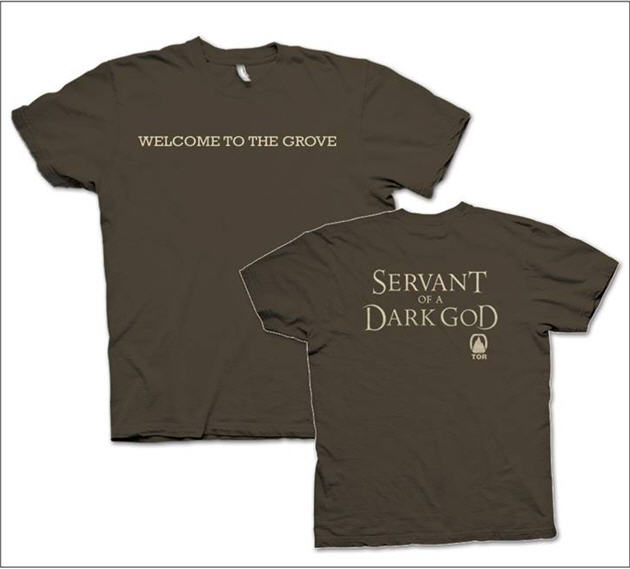
    So we’ve decided on the design. It will say “Servant of a Dark God” on the font as shown. We might put “Welcome to the Grove” or “Beware, the Mother is Watching” on the back. It will NOT have the Tor logo indicating it’s a book. Who knows what that is anyway? Instead, the question is whether to put my name on the shirt in some fashion.

    Option 1

    Some suggest that it’s better to just have a shirt that has the crazy label, suggesting the wearer is a servant of a dark god. It’s provocative, and if someone asks, the person wearing it can talk about the book. With this option we would NOT put my name on the t-shirt, just a small open book icon under the title. The idea behind this is that those who would buy the shirt would already be fans and the provocative statement will do more to spread the word than my name because going this route will make the shirt more fun to wear.

    Option 2

    Others think that you should have your name on the shirt to advertise. So we’d put “by John Brown” underneath the title. Or we’d put it on the back of the shirt. But some say it would make the shirt less fun.

    What would you prefer and why?

    Mind-boggling question number 2

    Because of the way we’re going about this, the color of the letters must be fixed. So the question is do we simply let people choose their own shirt colors that they thing will work with the color of the lettering or fix both the color of the lettering AND the shirt?

    Option 1

    Fix the shirt colors. Brown for guys and plum for women. Make the lettering a fantasy green or cream.

    Option 2

    Give people as much choice as possible and choose a font color that will work with the bulk of the shirt colors here: http://gildan.com/distributors/colorpalette/.

    But what would color would do that and still say fantasy, or would it matter?

    So which option to you think would work best? If you chose option 1, which colors?

    Mind-boggling question number 3

    Why is John worrying about this? Shouldn’t he be spending his time tracing his ancestry back to old grandpa lemur?

    The answer to that is that John’s mind works in mysterious ways, dear Reader. You must bear with him. And you must now face your greatest fashionista test ever: which colors would say fantasy and still be something people would want to wear? I will be making shirts up for the book store employees to wear before I come to signings.  So I have to decide. Someone suggested plum is all the rage this year for women. Make the letters a nice new willow green. We could have another color for men. Any ideas of what would appeal broadly?

    I await your ideas.

    (Ha, look at this. It appears one of my greats did indeed live his life out in the Prague menagerie. Hum.)

    Share