Interview on Fantasy Dreamer’s Ramblings
This was a fun interview with Donna of Fantasy Dreamer’s Ramblings.
This was a fun interview with Donna of Fantasy Dreamer’s Ramblings.
FOR IMMEDIATE RELEASE
Findings presented at national American Library Association conference reveal science fiction & fantasy literal gateway drugs to youth literacy
CHICAGO, ILLINOIS | July 11, 2009 | Utah’s newest author, John Brown, summarized statistics and research at the 2009 national American Library Association (ALA) conference held in Chicago which suggest that science fiction and fantasy are two of the main gateway drugs to literacy for youth. Data provided by Nielsen BookScan, public libraries, and recent studies published by the National Endowment for the Arts (NEA), suggest that at least 1 in 3 youths read for the effect produced by Science Fiction and Fantasy. “However,” says Brown, “given library circulation statistics, that number may well be 2 out of 3. These are incredible numbers, and have important implications for youth reading programs.”
According to Brown, “the latest research in emotion shows that reading fiction produces a physical response, as real and physical a response as when we take aspirin, alcohol, or crack. The good thing is that while stimulating pleasure centers, it doesn’t change the brain the way hard drugs do. Furthermore, it also carries the powerful and desirable side-effect of improving reading skills. The key is in finding the type of fiction which appeals to the given age group. And for youth it appears that drug of choice is science fiction and fantasy.”
John Brown’s epic fantasy for teens and adults, Servant of a Dark God, will be released in October 2009 by Tor Books, the largest publisher of science fiction and fantasy in the world. For more information see the links below.
A number of people have asked for it, and I’m now happy to announce I’ve posted the opening chapters to SERVANT OF A DARK GOD in the Novels section of my site.
Read!
Enjoy!
And then come back to beg for more.
I have now moved from the struggle into the resolution. It’s all down hill from here. I expect the novel to be 70-80k words. The shortest novel I’ve written yet. But I always seem to add on most of my revisions. I hope to keep it shorter, but we’ll see.
Now you may ask, hey, how does that compare with other thrillers? Well, here are the lengths of a few of James Patterson’s.
| Title | Words |
| Honeymoon | 65,572 |
| 4th of July | 68,000 |
| Lifeguard | 71,634 |
| Mary, Mary | 72,426 |
| Judge and Jury | 74,288 |
| Doublecross | 70,753 |
And here are some more by some other authors.
| Author | Title | Words |
| Lee Child | Gone Tomorrow | 146,000 |
| Lee Child | One Shot | 124,000 |
| Lee Child | Killing Floor | 162,000 |
| Lee Child | Persuader | 164,000 |
| Michael Connelly | The Brass Verdict | 145,000 |
| Ridley Pearson | Cut and Run | 114,000 |
| Robert Crais | The Watchman | 82,000 |
| Robert Crais | Taken | 84,000 |
| Robert Crais | The First Rule | 76,000 |
| Robert Crais | The Sentry | 82,000 |
| Brad Thor | Full Black | 117,000 |
| Brad Thor | Athena Project | 102,000 |
| Dean Koontz | The Good Guy | 93,000 |
| Dean Koontz | The Husband | 94,000 |
This is a story of how things went wrong and then went right. It’s also a cautionary tale for indie authors who want to direct their own art.
Victor Minguez did the art for Servant, which I think is awesome, so I naturally wanted him to do the art for the second book as well. I started as I have before by working up a detailed creative brief which stated my goals, suggested color scheme, identified the scene I thought we should illustrate, and provided plently of reference images. The goals for this illustration were that it had to say epic fantasy, fit with Servant, have energy, and pop in thumbnail.
Victor came back with these sketches. I thought all of them were great concepts. The framed and rear view depict the moment before something dramatic is about to occur, as if something dangerous is out in the woods. The front view was well into a dynamic scene. I loved the contrast of the framed sketch, but was drawn most to the dynamic rear view. (Click on any image to see it full size.)
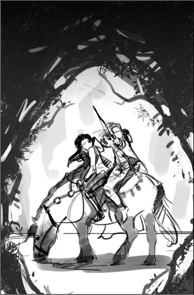
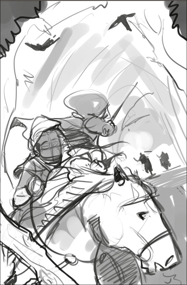
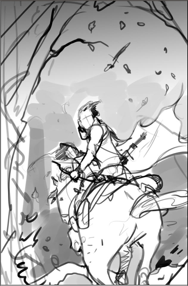
I knew from the last project that we needed to make sure that the illustration would integrate with the title and author’s name. And because we are going to brand the series, in part, by keeping the author name and title in the same position on all the books, I thought we needed to zoom in a bit. I tried various angles. Ultimately, we decided to flip it.
Victor then did another sketch with values to nail it all down. I thought this sketch was awesome. There was energy. It said epic to me. I was drawn immediately to the characters. I thought we had great contrast.
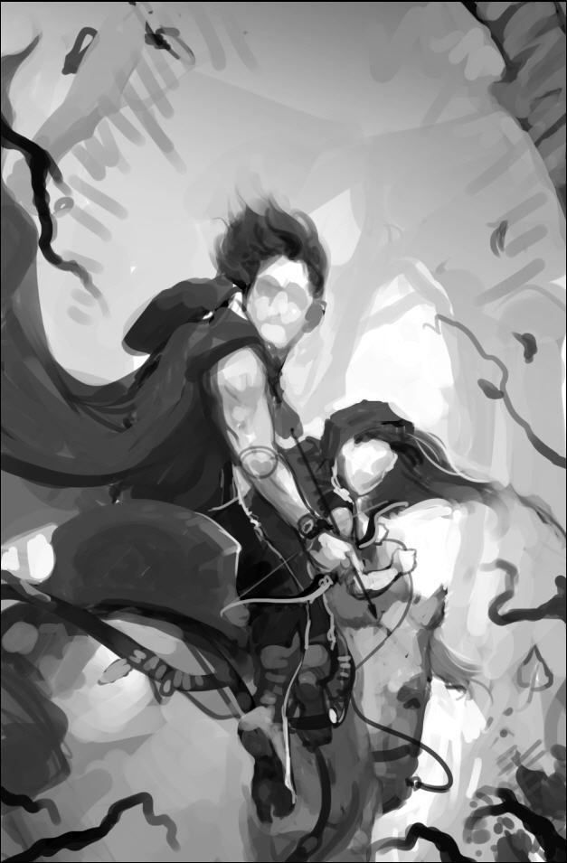
So the next step was to start laying in some colors.
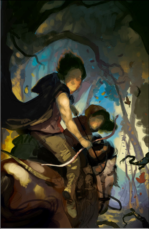
And here is where the cautionary tale begins. I think I have a good eye. I know when something is working. But I’m not a trained artist. And I’m not a trained art director. Which means that while I have a feeling of where in general I might want something to go, I don’t know exactly what will get us there. And that means that sometimes I’m going to do a lot of, let’s try this, nope that isn’t it, let’s try this instead. Naw. Maybe this. And as I begin to ask the artist to tinker, the risk of me directing us into something that doesn’t work, and forcing the artist to work way over his or her budgeted hours increases dramatically. It also sometimes increases the risk of me losing sight of the end goal.
I keyed in on my desired color scheme. But a color scheme is a means to an end. I got trapped thinking about the means, not the end. So I asked Victor to get more gold and blue. Open it up.
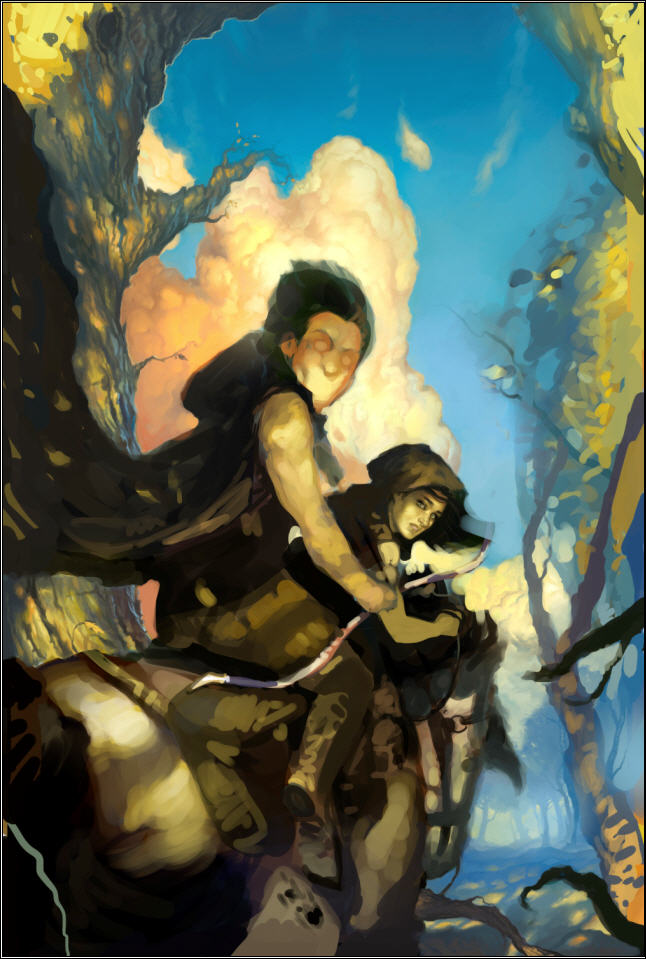
Can you see me taking us away from the original concept? Not necessarily a bad thing. Art is often iterative. But I wasn’t done. I wanted color. At least, I thought I did.

Do you see where this is heading? But I had this idea and was determined to see it implemented . . .
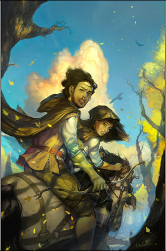
Well, we got to this point. The artist was delivering what I’d asked. And it was shaping up to be a fine piece of art, but it was totally wrong for the book and genre. What’s more I was driving the artist nuts. For every change he’d make, I’d bring up two more. I was way too far into the details. I’d taken us way off course. And burned up all his hours doing it.
What do you do?
Luckily, I know someone who IS an experienced illustrator, who has worked on many different projects, and who was willing to step in as art director. Most importantly, with me out of the picture, the artist was willing to give it one more go with this new guy at the helm. I stepped completely away from the process. Here’s what happened in the words of the director (who wishes to remain anonymous).
ART DIRECTOR TO THE RESCUE
The goals for this image were to say fantasy and be eye grabbing at a very small size. I was brought on to accomplish those goals. I think we all felt that the image was too peaceful. It contradicted the feeling of danger we were going for.
Take two: John gave me the old thumbnails that Victor had. At first I looked to see what could be salvaged from the old completed painting to use in the new, but ultimately Victor came up with a more dynamic sketch, and we decided to go for it.
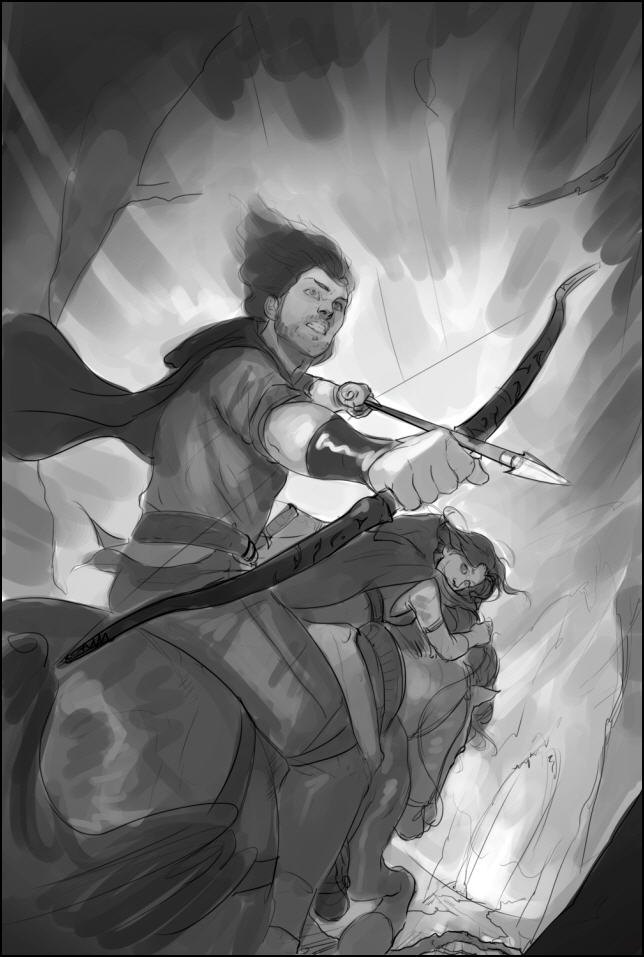
So we started there. The processes was an iterative one. Victor blocked it in, and we nailed down the values/black and white image. Values are the underpinnings of a painting; you want that to work on an abstract level first. Meaning if you didn’t know that it was a painting of Talen and River riding away on a horse, would the value patterns still be both striking and pleasing? There is no point in proceeding with a painting if either the drawing or the values are failing. After that came the color study.
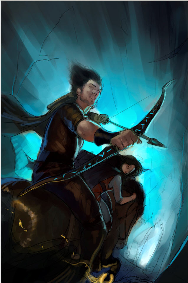
Once nailed, we went to finish. Victor really put his heart into this and it turned out awesome! He’s got great talent, and is a pleasure to work with.
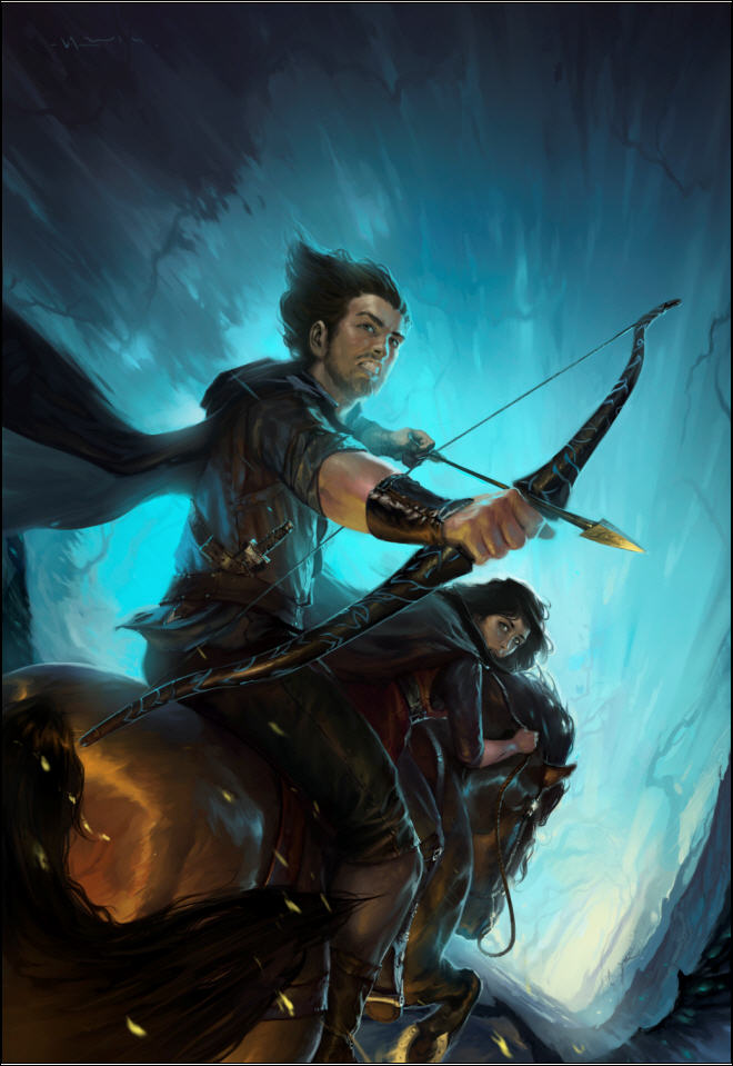
JOHN AGAIN
Are Minguez and Un-named Director good or what! It says epic fantasy. It says action. It has the level of darkness and energy we need. And it looks like it belongs with the cover of Servant. It’s going to work great, and I think the cover will pop in thumbnail, especially when we add the title (white, like Servant) and author’s name (probably a bright color taken from arrow head or horse shoe).
So lessons learned from this and the previous covers:
And now a mystery.
I want you to look at the final image again. It’s not actually the final, final image. We had to ask the arist to make one more change because something was off. I will give you a hint. The change had to be made in the lower 1/4 of the image. Look at the image and see if you can find it. Do you see it?
In the next post about this art I’ll both reveal what needed to be changed and tell you something about this artist that I think you’ll find both inspiring and amazing.
Dude…
I can’t tell you how excited I am to know a cover artist has been chosen for Servant of a Dark God. And that it’s Raymond Swanland. Check this out.


Without importing his whole gallery, I’ll link to a number of those I like the best. But I have to say the movement, action, energy–even when the people are standing still–are amazing. I think I like most his pieces that are lighter and have more color (and think they’ll match the book’s content best as well), but I can’t wait to see what he comes up with. I think Swanland is just jaw-dropping amazing.
http://www.raymondswanland.com/Pages/Personal%20Gallery/Personal03.html (Love the color and energy; the sky color and figure is just, dude)
http://www.raymondswanland.com/Pages/Personal%20Gallery/Personal01.html (Love the color and energy; again, the sky color…)
http://www.raymondswanland.com/Pages/Illustration%20Gallery/Illustration04.html (the guy’s standing still and this thing is still rippling with energy!)
http://www.raymondswanland.com/Pages/Illustration%20Gallery/Illustration17.html (wow)
http://www.raymondswanland.com/Pages/Illustration%20Gallery/Illustration11.html (color and energy)
http://www.raymondswanland.com/Pages/Illustration%20Gallery/Illustration10.html (movement; I don’t know, some artists just don’t get action right, but this one does, holy crap)
http://www.raymondswanland.com/Pages/Illustration%20Gallery/Illustration05.html (movement)
http://www.raymondswanland.com/Pages/Illustration%20Gallery/Illustration19.html (look at the pov and movement, the belly of the dragon up in the right–have we ever seen this angle on dragons before? It feels like we’re IN the sky)
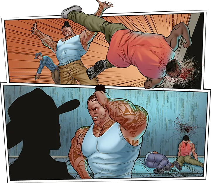
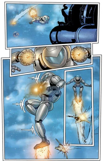
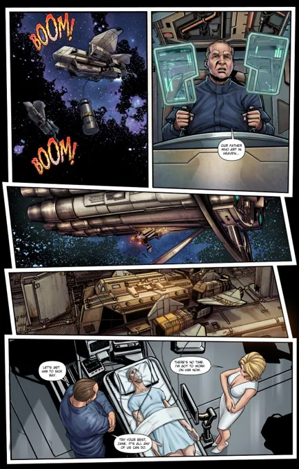
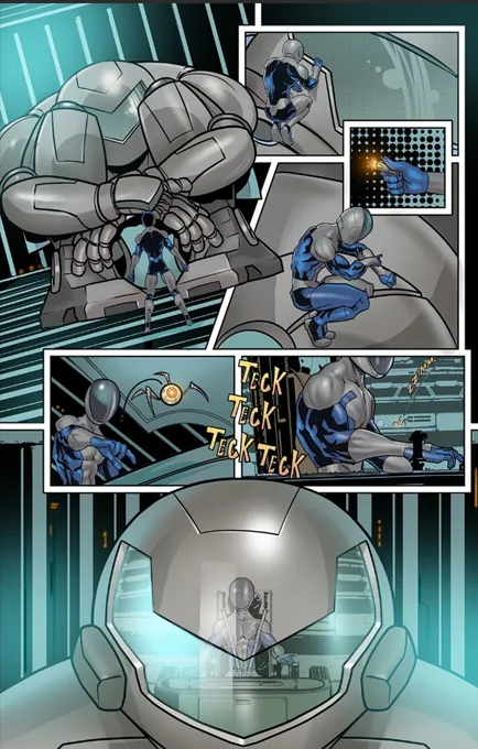
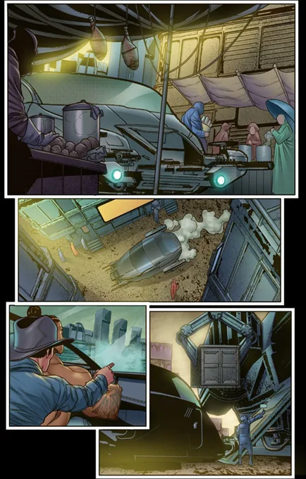
The Dragon Award winning novel Gun Runner, by Larry Correia and me, is being adopted into a graphic novel by Hound Dog Media. The writer is the legendary Mike Baron (The Punisher, Nexus) and the art is by Marcelo Salazar.
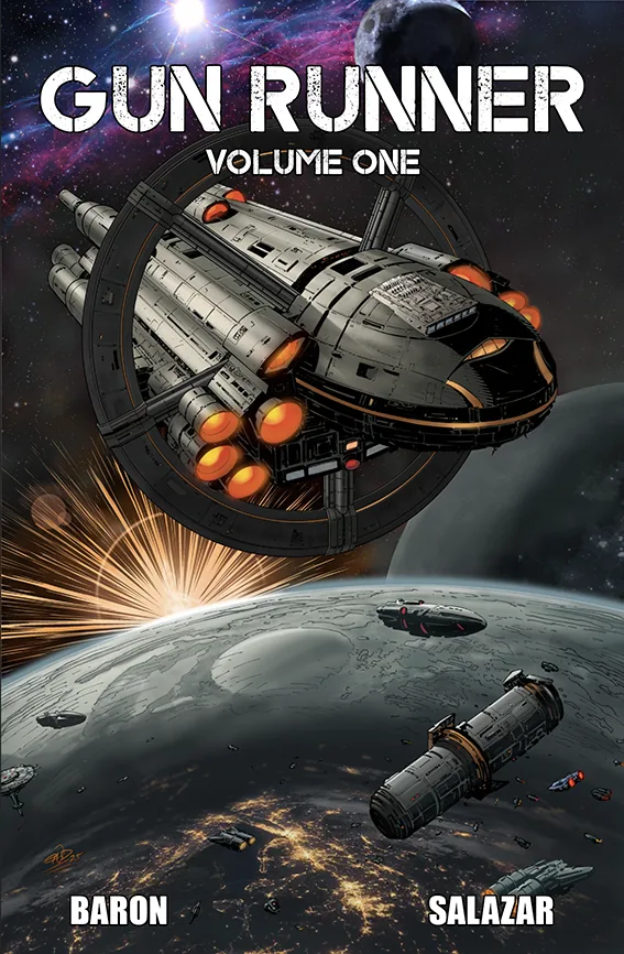
This is a story about a smuggler crew who specialize in stealing battle mechs and selling them to worlds that aren’t allowed to have them. The book is great. I can’t wait to see it as a graphic novel.
This is going to be awesome. Check it out. There’s even a pledge level to get yourself drawn as a member of the crew.
Comments are closed.

Wonderful interview. You make me laugh.
And I never really thought I possessed much humor-fu.