
Similar Posts
Goodies from Curse of a Dark God
Bow to the dark god, ye minions. Here’s some of what’s coming in book 2:
- The dogmen of Toth and their maulers
- The Ungar and the one they call Ruin
- The tanglewoods of the woodikin
- Firesteeds
- Gloryweaves
- Nashrud the hunter
- And last, but not least, the Orange-eyed priest of Mungo
The end is in sight on the first draft of book 2 in the Dark God series, and because this one has been a roller coaster, I had to post some of the coolness before I have to go back into frantic mode. My word count estimates for this book have been so consistently off it hasn’t been funny. Literally. It’s made me panic and stress. It should clock in around 220k. And then it’s going to be cut, cut, cut.
In the meantime…dogmen of Toth (give it the James Earl Jones).
Oh, baby.
Idaho Librarians
Just got back from the Idaho Librarian conference in Soda Springs.
- Had a wonderful time. Got to meet a lot of great people. I just love librarians.
- Organizer Cindy Erickson was so very gracious. She even promised to take my wife and girls huckleberry hunting. Not only does she reference books, she references the sweet harvest spots!!
- Drank my first bottle of Hooper Springs sparkling water–naturally carbonated mineral water. It wasn’t too bad at first, but I can still taste the minerals seven hours later 🙂
- Borders from Logan came up and sold a whole bunch of my books. The sales manager was very positive about the new corporate management. I hope things go well for the bookstore.
- Locked myself out of my car. But I have a solution now, thanks to one of the librarians (how do they know so much?), that will never ever ever ever fail. I will never be in that situation again. No, I’m not talking about a magnet key box somewhere.
- Told myself I am getting a camera to take to these things next week. That’s it. I want pictures of all these fine folks.
Behold, the Opening Chapters of CURSE OF A DARK GOD
For your reading pleasure, I have posted the current version of the first 12 chapters of Curse of a Dark God below. (And there was much rejoicing, yea.)
Read and enjoy!
CURSE OF A DARK GOD draft 3 chapters 1-12 reader
Note: these are draft chapters and may change in the final version.
If you would like to be part of a test audience, please open the document and begin reading just as you would any book that you picked up because it looked interesting. Stop where you normally would. Then email me by clicking on the Contact John link under my photo up on the left. I’ll send you a couple of questions. Please make sure you don’t ask for the questions before you’ve given the bit above a go (I don’t want the questions to affect your reading). Also, don’t put any critique hat on. Just read as you normally would. 🙂 The deadline for test audience responses is January 15th.
Awful Intent Cover Reveal
For Awful Intent, I looked around at different cover design shops and decided to use Damonza. I sent over the brief, and we began. What I needed was a cover in the same style of Bad Penny. A match. I also told Grady, the designer, that if he did something new with Bad Penny, I might consider it.
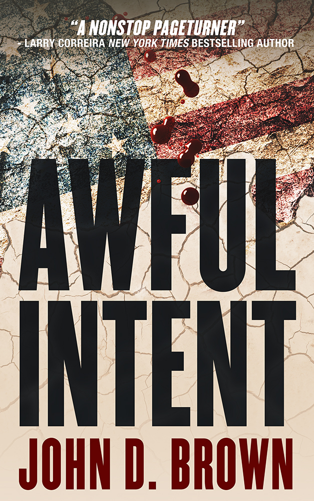
He sent back these.
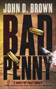
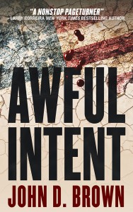
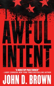
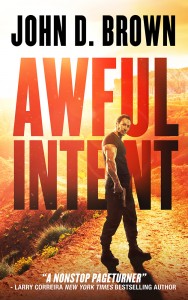
I loved what he did with Bad Penny. But it was nowhere near what we’d done with the original. And none of the others matched either. And that was a problem. I need all of the covers in the series to look like siblings.
We went back and forth with a number of iterations. Then decided to focus on Bad Penny.
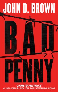
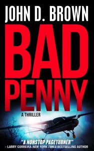
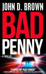
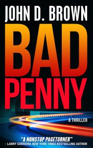
And then I realized that I was falling prey to shiny object syndrome. It’s the bane of my life. There were all sorts of great ways to approach the cover, but I had already spent hours sorting through all that with the Bad Penny original. And the cover must be doing okay, because we sold lots of copies last year. I decided for everyone’s sanity to stick with the original decisions and parameters. That meant:
- Bold, action-thriller colors
- High contrast
- Big fonts
- Some texture
- And some small element over top
But I was still having a hard time clarifying in my mind something that was eluding me. Luckily I was in Cedar City for the Shakespeare Festival at the time and having lunch with Dixon and Linda Leavitt. Dixon pointed out that I was waffling between a literal and symbolic approach. Once he said that, I could see exactly what he meant. For example, the Bad Penny in the first batch was painted on a board. It was more realistic. The red Awful Intent was more symbolic. He also pointed out that I had used a small element in the original. With that clarity, we went back to work.
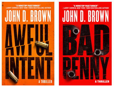
I’m very pleased with the finals (BTW, I’ll be tweaking the text above my name in Awful Intent; so that one isn’t final-final yet).
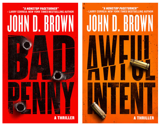
I think they say action thriller loud and clear and will easily stand out in a line-up.
Where in the Sam Hill is Curse of a Dark God?!
Because of so many reader requests, I think it’s time to explain.
Alas, I must report that she ran off with a no-good tramp. I’m sure she’s realized her error. Either way, I’ve formed a posse. We’re hunting her down.
That’s the true story. For those that want the boring press release that obscures the facts, you may read what follows.
The first draft of Curse of a Dark God was delivered to the editor in August of 2009, two months before Servant of a Dark God was released. That draft had some issues with a few of the story lines. These issues crept (they did not run or slouch) into the text because the author, stressed about an aggressive deadline, decided to adopt the fix-it-when-you-finish-just-get-er-done-you’ve-got-a-freaking-deadline methodology of writing.
But a book of 230,000 words is a big old momma. And if something in a beginning chapter is off, it wankers a whole heck of a lot of story that follows, much like a line of dominoes. But it’s not just one story line. This book had multiple interconnected story lines. So issues in one line rippled out into others. What this meant was that the changes that needed to be made weren’t wee things that could be dealt with in a few weeks. When the dust settled, it was clear the book required a substantial rewrite, even though the draft contained gobs of cool story.
So much for that fix-it-later experiment. You can be sure the author won’t be using that on large books again.
So the author wrote another draft of 245,000 words and delivered it in August of 2010. The story rocked. Unfortunately, there was a miscommunication on size (and there’s no use in having a drama about what was said and who was at fault and why fairies are always tiny hot chicks; despite our best efforts, life is full of bumps; the best thing to do is learn from them and move forward). The book actually needed to be in the 170,000 – 180,000 word range. Same as Servant of a Dark God.
In a 10% edit, you’re tightening a story, cutting out the fluff. In an edit designed to reduce the book by 30% or more, you’re cutting off arms and legs and removing things like livers. The story can’t survive such cuts unless the thing was obese to begin with and just needed to go on a diet. Unfortunately, Curse of a Dark God draft 3 was fairly lean, given the amount of story it contained. It was NOT a candidate for Biggest Loser.
The upshot is this third draft is going to be another major rewrite. Which means, given publishing lead times, that it’s going to take a number of months to get it on the shelves.
(fricken, ricken, grumble, frag a friggen nack)
Because I’m just starting on the outline, we don’t have a delivery date yet. As soon as we do, I’ll post it.
I apologize to all of you expectantly looking forward to the next book. When I started this series, I promised myself that I would not leave my readers hanging. I was determined that my books would come out in a timely fashion. And I have been working like a devil to do just that, but sometimes things happen. What I can promise you is that this draft will go quickly. Furthermore, I already have book 3 outlined. It should go quickly as well.
I know some of you are asking why? Why, the word limit? Aren’t there are plenty of monster books out there?
There are. In fact, about half of Robert Jordan’s Wheel of Time books are roughly the length of draft 3. Publishers do sell fat books. However, the bigger the book, the harder it is to make it profitable.
First, bigger books cost more. There’s the cost of the additional paper and editing, but there’s also the extra money to ship and store.
Second, you can’t put as many copies out in the stores. You can’t because they take up more of the space that might be allotted to an individual book. So instead of being able to have stores stock four or five copies of a 120k novel, they can only stock two or three of a big old momma in that same space.
Third, bigger books cost you, dear reader, more money. Sure, the publisher might eat some of the additional costs, but some of those costs will be passed onto you.
So because of the increase in cost, the publisher needs to sell more copies; however, the limit on display space and the higher price make it harder to sell those additional copies and actually may lead to selling fewer copies.
Do you see the bind?
This doesn’t mean big books can’t be profitable. It just means that it’s not as easy. It’s a bigger risk. Part of me would want the publisher to take that risk. But the other part of me knows that slow and steady usually wins the race. Neither I nor the publisher want to gamble the long-term viability of the Dark God series. Now, if Tor was doing this all in paperback, this might not be such a big issue. But we’ve got the sweet hardback/paperback deal. And business projections have to be done in that world.
So the short of it is that we’ve run into some business limitations, and it’s going to take me a bit more time to deliver.
I wish I could announce a date at this time, but I can’t. I’ll finish up the outline for this draft and run that by the publisher around Christmas. Then it’s back to work. I promise that what you’ll get will be my best. And that’s what you want, anyway, even if it takes a bit longer to get it into your hands.
Sura cover reveal
Behold the cover. A big thanks to Dixon Leavitt for the art.
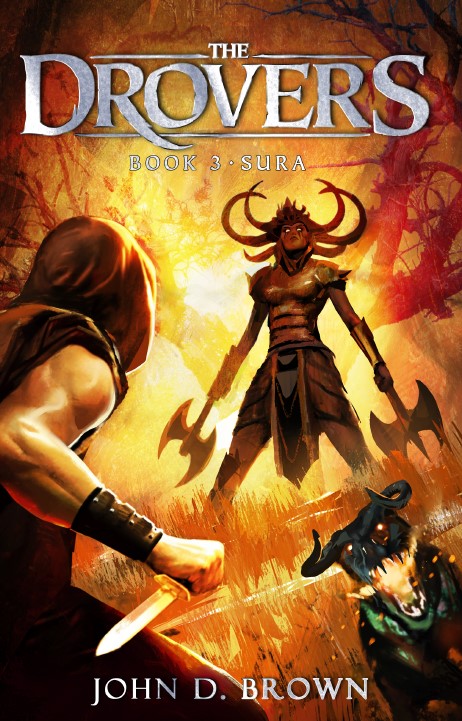
And here’s the description we’ll be using.
Nobody in their right mind travels through this place.
All Ferran wants to do is get the cattle to Broniss, get paid, and free his family from the threat of slavery. But an unexpected and terrible enemy takes most of the crew prisoner in the Blight.
Ferran, Winwallom, and Sura, the fierce Mashadian girl none of the boys trust, must free them.
But how will they when the trio is vastly outnumbered, they’re days from help, and other things lurk in the woods?
I’m so excited to get this book into your hands. I had a blast writing it.
If you don’t want to wait, Sura is now available for preorder.
4 Comments
Comments are closed.
Is “Lovely Agent” different from “Super Agent Caitlin” who is holding up Curse of a Dark God? Next month, it will be a year since you finished it, right?
They are the same, and Super Lovely Agent hasn’t held anything up. These delays were at the publisher. However, I do have some good news. The problem is I’m going to have to wait until everything is finalized to share it.
Sorry, didn’t mean to blame the wrong party. But as you say, you haven’t given us much information to work with!
I know!