NEWS: LDStorymakers Conference

I have finished the final drafts of my two presentations for the LDStorymakers conference which will be held next Friday and Saturday, May 10-11, 2013 in Provo, UT (usually a glorious time along the Wasatch Front in Utah).

“Vivid and Clear” – Despite the often repeated 11th commandment for writers—show, don’t tell—writers NEVER show. They can’t. It’s all tell, tell, tell. The trick is to tell in a way that helps your readers imagine the situation (action, thought, dialogue, description, etc.) with such vividness and clarity it can trigger an emotional response.  In this hour we’ll explore a number of simple but powerful prose techniques that help you do just that. That includes:

  • The three main types of telling
  • What “showing” really means
  • 5 key techniques for making that telling vivid and clear
  • Lots of examples so it’s all clear

“Story Turns” (they’ve got me scheduled to do this one twice) – Story turns, cliffhangers, rugpulls, plot twists, reversals, surprises, revelations (and more)–are a core part of an exciting plot, pacing control, and making a reader want to turn the page. In this workshop we’ll explore the main types of story turns and how they work so you can use them in your writing.  This includes:

  • A clear definition of what turns are and do in general
  • The 5 main types of turns
  • A whole bunch of examples to make it all clear
  • 3 tools I find helpful when developing turns
  • A session where we actually will use the tools to develop turns for a scenario I’ll bring

I’ve got to run through both presentations to make sure they have the zing I look for in these things and that I don’t have too much content for the time allotted. I’m very excited about both. And, as always, I learned a lot bringing all my ideas together on these topics.

I’m planning on having a great time giving these AND listening to the other presenters AND chatting with folks I know AND meeting others. Last year was fabulous! This year looks to be even better.

For those of you who haven’t heard about the conference, it features 2 days of excellent programming focuses on helping writers who are serious about writing but who also want to have fun doing it–let’s call them hard-working, laffy bees.  Special guests include goddess of mystery Anne Perry plus a bunch of great agents and an editor from Harlequin’s new line focusing on “wholesome contemporary romances that celebrate traditional values, strong communities, family connections and true love.”

Although I have to say that if I were thinking of submitting to Harlequin, Kris Rusch’s posts would give me pause:

I think registration is still open. For those of you already planning to go, please come up and say hello.

BTW, I’ll post a PDF of both the presentations and my notes here afterwards.

Share

Similar Posts

  • Servant cover art

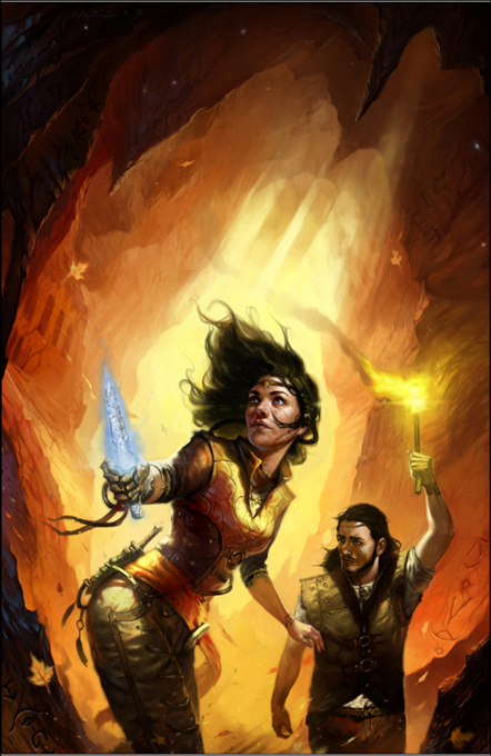
    The cover illustration for SERVANT is finished!

    (and there was much rejoicing.)

    yea.

    Actually, there was DANCING. Because I think the final piece rocks. The artist is Victor Minguez. Here are two of his pieces that I really enjoy.

    The first is “Angel.” I love the bright contrast, the face, and the fact that there’s so much rich detail.

    The next is “Champagne Havoc.” Again, a wonderful face, but also an awesome idea (a robot carrying a woman in the palm of its hand), and then the lines and chopper give the whole piece a lot of energy.

    Click here to see other works in his portfolio.

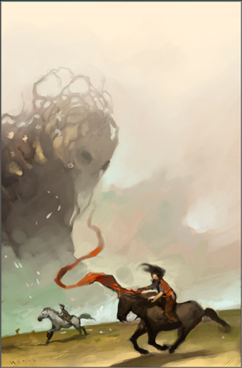
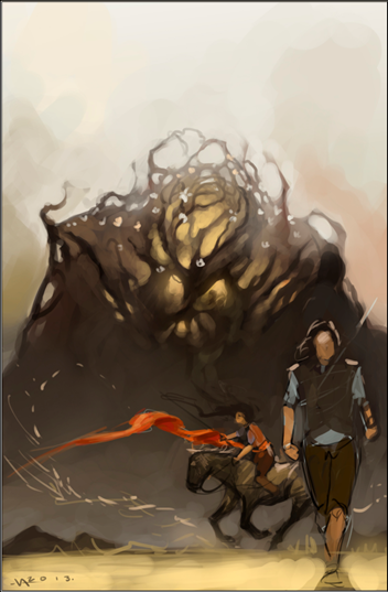
    So we kicked the project off by me sharing the goals I had for the cover and tons of reference on everything from color scheme to character costume. I asked Victor to develop some concepts for an ensemble of Hunger, Sugar, and Talen as well as some for the cave scene towards the end of the book. He came back with these sketches.

    Servant Sketch 1 cave Servant Sketch 2 horse ensemble

    Servant Sketch 3 ensemble Servant Sketch 4 cave

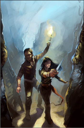
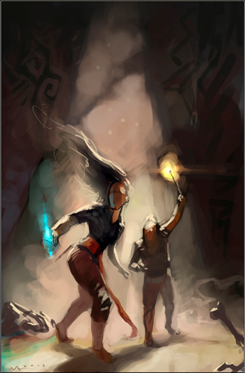
    I liked the first because it would allow us to see the figure’s faces more clearly. And there was a lot of interesting detail with the cave. Look at the roots by the entrance. I also liked the structure. I liked the third because it included Hunger, and Victor was taking Hunger in a new direction. I also thought we could do some neat things with the energy of Sugar on the horse and that long sash. The fourth one, however, just felt right. It had so much potential energy. I was immediately drawn to the body language. And so this is the one we decided to develop.  Then one of my beta art viewers suggested moving closer and putting in more strong diagonals. It was a perfect idea. Victor agreed and came back with this.


    Servant WIP 1

    I liked the lines of her stance but wondered if she needed something stronger with her legs. Victor adjusted, but my idea just wasn’t an improvement.

    Servant WIP 2

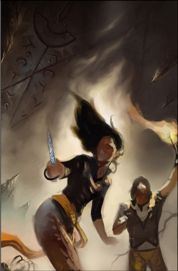
    So we decided to stick with the previous version. However, this was all too dark. Way too much gray. When looking at things in thumbnail, the cover has to pop. I shared more reference images. And Victor went back and delivered this.

    Servant WIP 3

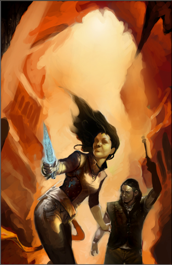
    Boom! That was exactly what I was looking for. Bright, dynamic. However, we needed a more neutral bit at the top for the title and author’s name. And the brightest spot had to be behind Sugar to draw the eye to her. Here was the next version.

    Servant WIP 4

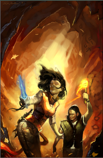
    At this point I started to dance. This was IT! There was a lot going on here. We had the high contrast I wanted. We had the energy. The wind with the hair and leaves and sash and torch all add kinetic energy. As do all the diagonals. Notice as well the cave details–we have hints at previous habitation, runes, and some interesting contrast with the dark foreground. I had shared a number of N.C. Wyeth and Tim and Greg Hildebrandt pieces as reference, and I think this captured elements of those and gave them a new twist. Note as well the sharp projections on Sugar’s behind. Victor put them in there purely for aesthetic reasons. He had no idea what they were. I loved them. He loved them. They worked. We would just have to make them make sense.

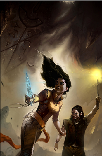
    After a few more iterations, he delivered the final.

    Servant Final

    I think it’s gorgeous. And will advertise the book perfectly. In a few days I will reveal the final cover with title etc. Shortly after that, SERVANT will be available again to please English readers worldwide.


    Share
  • Need your Dark God T-shirt input

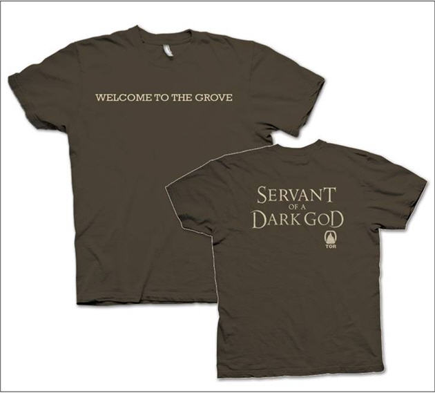
    I’ve got a deal to make t-shirts for my book available, and I have to make some decisions. The problem is that I am terrible at making these kinds of decisions. So I’m asking for your help. Any input would be appreciated.

    Mind-boggling question number 1

    So we’ve decided on the design. It will say “Servant of a Dark God” on the font as shown. We might put “Welcome to the Grove” or “Beware, the Mother is Watching” on the back. It will NOT have the Tor logo indicating it’s a book. Who knows what that is anyway? Instead, the question is whether to put my name on the shirt in some fashion.

    Option 1

    Some suggest that it’s better to just have a shirt that has the crazy label, suggesting the wearer is a servant of a dark god. It’s provocative, and if someone asks, the person wearing it can talk about the book. With this option we would NOT put my name on the t-shirt, just a small open book icon under the title. The idea behind this is that those who would buy the shirt would already be fans and the provocative statement will do more to spread the word than my name because going this route will make the shirt more fun to wear.

    Option 2

    Others think that you should have your name on the shirt to advertise. So we’d put “by John Brown” underneath the title. Or we’d put it on the back of the shirt. But some say it would make the shirt less fun.

    What would you prefer and why?

    Mind-boggling question number 2

    Because of the way we’re going about this, the color of the letters must be fixed. So the question is do we simply let people choose their own shirt colors that they thing will work with the color of the lettering or fix both the color of the lettering AND the shirt?

    Option 1

    Fix the shirt colors. Brown for guys and plum for women. Make the lettering a fantasy green or cream.

    Option 2

    Give people as much choice as possible and choose a font color that will work with the bulk of the shirt colors here: http://gildan.com/distributors/colorpalette/.

    But what would color would do that and still say fantasy, or would it matter?

    So which option to you think would work best? If you chose option 1, which colors?

    Mind-boggling question number 3

    Why is John worrying about this? Shouldn’t he be spending his time tracing his ancestry back to old grandpa lemur?

    The answer to that is that John’s mind works in mysterious ways, dear Reader. You must bear with him. And you must now face your greatest fashionista test ever: which colors would say fantasy and still be something people would want to wear? I will be making shirts up for the book store employees to wear before I come to signings.  So I have to decide. Someone suggested plum is all the rage this year for women. Make the letters a nice new willow green. We could have another color for men. Any ideas of what would appeal broadly?

    I await your ideas.

    (Ha, look at this. It appears one of my greats did indeed live his life out in the Prague menagerie. Hum.)

    Share
  • Another positive review of Servant of a Dark God: Fantasy Debut

    Tia Nevitt writes the Fantasy Debut blog where she reviews “All Debut Fantasy . . . (almost) All the Time.” She’s posted a review of Servant of a Dark God that points out some interesting differences between this epic fantasy and others. She is also one for whom the family aspect of the story resonated. In fact, she’s the first that’s really highlighted it. She has an interview with me coming out later this week where I discuss that aspect of the novel. Finally, I really like how she captured one of the core issues of the story below. I wish she’d been there when I was sending my queries off to agents and editors 🙂

    Servant of a Dark God by John Brown is one of those novels that I pick up with some reluctance, not really thinking it’s for me, but then I end up enjoying it thoroughly.

    Mr. Brown has taken a very different approach with Servant of a Dark God. This is an epic fantasy that does not involve epic journeys, recent calamities or long-term character arcs. It does involve long-term lies; the kind of lies that are told over such a long period of time that they are thought of as truths. Full review of Servant of a Dark God. 

    Share
  • Drovers Update: Draft 2 finished

    Huzzah!

    I just typed the final words of draft 2 of the first book of The Drovers. It now goes to my beta readers (I’m the alpha reader, the one who sees draft 1). And while they’re reading, I will begin draft 2 of the second book.

    This is the shortest novel I’ve ever written, clocking in at 61,000 words. My target was 50,000 words, the average size of a Louis L’Amour western. But this will do. Depending on the beta reader feedback, I may add or cut a few thousand words. But not much.

    I still don’t have a series name, dang it!

    The Queen’s Drovers?

    Share
  • Servant of a Dark God is a Whitney Award finalist

    Yea! Thanks to those of you who nominated. The judges have chosen Servant of a Dark God as a Whitney Award finalist. Of course, the four other books in the category are great. Here’s the list of finalists in my category:

  • Servant of a Dark God by John Brown
  • The Maze Runner by James Dashner
  • Wings by Aprilynne Pike
  • Warbreaker by Brandon Sanderson
  • I Am Not A Serial Killer by Dan Wells
  • Check out all finalists in all categories here. If you click on the Whitney Academy link on the top of that site, you’ll see all the folks who will be voting on the finalists.

    Share

3 Comments

  1. I have to say that your workshop was the best. I am so glad I attended. The information and suggestions you offered were so well presented. I learned so much that will help me in my continued endeavors as an author. I have 5 published books so far and you have given me the enthusiasm and desire to continue to write and write and write.

    Thank you

  2. I have to say that your workshop was the best. I am so glad I attended. The information and suggestions you offered were very well presented. I learned so much that will help me in my continued endeavors as an author. I have 5 published books so far and you have given me the enthusiasm and desire to continue to write and write and write.

    Thank you

Comments are closed.